ダッシュボードでは、リリースは成功したと言っています。新規登録が増え、ログインが増加し、チームは安心感を感じています。
しかし、2週間後、サポートチケットの件数は減りますが、製品が正常に動作しているためではありません。新規ユーザーは戻ってこないのです。パワーユーザーは少数ながら活発に活動していますが、ほとんどの新規アカウントは静かにいます。アクセスを提供しただけでは、採用にはなりません。
その差は ユーザー採用指標 は、より難しい質問に答えるために存在します。 “ユーザーが来ましたか?” ではなく “ユーザーが価値を得たか、戻ってきたか、製品を日常のルーティンに組み込んだか?” という質問に答えるのです。このシフトは重要です。新規登録数とログイン数はしばしば虚偽の指標です。ユーザーがドアハンドルのハンドルを触ったことを示すだけです。製品を完全に入居させるかどうかは示しません。
製品チームにとって、これは実際に現実になるのは、リリースが紙上では良好に見えますが、実際には弱いときです。コラボレーションツールは、多くのアカウントが作成されるかもしれませんが、ユーザーが最初のプロジェクトを作成したり、チームメンバーを招待したり、後で戻ったりするのはごくわずかです。モバイルアプリはダウンロードが増えますが、ユーザーがオンボーディングを完了したり、製品が有用になる最初のアクションを完了したりするのはごくわずかです。そういった不一致に直面している場合、すでに正しい質問をしていることになります。

より良い枠組みは、採用をアクセスから習慣までの旅として扱うことです。つまり、ユーザーが製品を理解し始める瞬間、最初に結果を得る瞬間、そして繰り返し行動する瞬間を観察することです。オンボーディング、活性化、そしてアプリユーザー体験の改善に取り組むチームは、通常同じことを発見します。ユーザーの最初の成功は、ユーザーの最初のログインよりも重要です。 __CAPGO_KEEP_0__ 目次
導入
- サインアップから真の採用まで
- 採用の8つの基本指標の解説
- 採用を効果的に測定して追跡する方法
- __CAPGO_KEEP_1__を理解し、基準を設定する
- __CAPGO_KEEP_5__のユーザーとアカウントの採用レベル
- __CAPGO_KEEP_9__を作成し、行動を起こす
- __CAPGO_KEEP_12__とAI、自動化の将来
導入 Beyond Signups to True Adoption
多くのチームは、店が歩く人数を数えるように成功を測定しています。多くの訪問者がいることは、すべてがうまくいっていることを意味します。しかし、製品は、人が一度訪問したことによって勝つことはありません。製品は、ユーザーが意味のある行動を完了し、繰り返すことを通じて勝つことになります。
それがなぜ、採用指標が存在するのかです。採用指標は、粗末なアクイジションの焦点を、製品の価値に関する行動的な視点に置き換えました。有用な質問は、「アカウントを作成した人はいくついるか?」ではなく、「製品が有用なものになったときに戻ってきた人はいくついるか?」です。
実用的なルール: 指標がユーザーの価値に接続していない場合、それが採用を改善するのに役立つ可能性は低いです。
プロジェクト管理アプリを考えてみましょう。ログインするのは、ジムのロビーに入ったことと同じです。ただし、それは誰も運動をしていないことを意味します。最初のプロジェクトを作成し、タスクを割り当て、次の日戻って進捗を更新することは、採用が始まっていることを示す行動です。
通常、3 つの種類の質問が最も重要です:
- 価値発見: ユーザーが最初の意味のある行動を完了したか?
- 繰り返し行動: 最初の成功の後、戻ってきたか?
- ワークフローに合致: 使用が日常化するまでの道のりはどのようになったか?
このガイドの残りの部分は、次の質問に基づいて構築されています。 一部のメトリクスは、オンボーディングがうまくいっているかどうかを教えてくれます。 他のメトリクスは、製品が習慣化されたかどうかを教えてくれます。 さらに高度なメトリクスは、B2B チームがより難しい質問に答えるのに役立ちます。 1 人の顧客が製品を採用したか、顧客全体が採用したかを判断するのです。
8 つの基本的なユーザー採用メトリクスを解説する
採用の簡単な方法
採用の最も簡単なアナロジーは、ジムの会員権です。 会員登録だけでは採用ではありません。 初めてのトレーニングに参加することは採用に近いですが、毎週のように戻ってくることが製品が誰かの生活の一部になったことを証明します。
同様の論理はソフトウェアにも当てはまります。 ClickLearn のユーザー採用メトリクスの概要によると、 採用は通常、目標世帯内のユーザーが達成した意味のある使用マイルストーンの割合として定義されます。 ただし、生徒数やログイン数だけではありません。 同じフレームワークには、採用率 = (新規アクティブユーザー / 総ユーザー) × 100 と 機能採用率 = (機能を使用するユーザー / 総アクティブユーザー) × 100 の式が含まれます。.
Core User Adoption Metrics at a Glance
| 指標 | 式 | 何を表しているか |
|---|---|---|
| アクティベーション | 製品マイルストーンによって異なります | ユーザーが最初の実際の価値を得た時点に達したかどうか |
| DAU/MAU | 1日あたりの有効ユーザー数/1か月あたりの有効ユーザー数 | 1か月以内に何回ユーザーが戻ってくるか |
| リテンション | 戻り時間帯によって異なります | ユーザーが最初のステップから戻ってくるかどうか |
| ユーザーロス | __CAPGO_KEEP_0__に応じて変化する | 製品を使用しなくなったユーザーの数 |
| 粘着度 | DAU/MAUでよく測定される | 使用が定期的な習慣になるか |
| 機能採用 | (機能を使用しているユーザー / 総有効ユーザー数) × 100 | 特定の機能が実際に重要かどうか |
| 価値時間 | サインアップから最初の価値の瞬間までの時間 | ユーザーが意味のある結果を得るまでの時間 |
| { | targetLanguage":"Japanese", | protectedTokens":["Cloudflare","Capacitor","GitHub","Capgo","code","API","SDK","CLI","npm","bun"] |
, texts":[". Adoption gets users into value. Retention shows whether they stay there.
What each metric is really telling you
Activation measures whether the user crossed the starting line. In a note-taking app, that might mean creating the first note. In Slack, it might be sending a message. The exact formula depends on your product, but the principle is stable. Pick the first action that proves the product clicked.
DAU/MAU compares daily active users with monthly active users. It’s a frequency signal. If many monthly users are also active daily, the product is likely becoming part of a routine.
"], 初期期間後、ユーザーが再訪するかどうかを確認します。なぜなら、ある製品は初期の印象が良好ですが、後に有用ではない可能性があるからです。
Churn Churnは、ユーザーが関与を停止したことを示す鏡の像です。Churnは有用ですが、主な操縦輪として機能するのではなく、警告灯として機能することを意識してください。Churnが上昇する時点で、原因は通常はアクティベーションまたは価値提供の開始時期より前に始まっていることが多いです。
Churnを追跡してくださいが、Churnを説明するメトリクスにエネルギーを費やすことが大切です。
Stickiness StickinessはDAU/MAUと一緒にしばしば議論されることがあります。多くのチームでは、2つの用語をほぼ同義語として使用しています。実際の考え方は簡単です。ユーザーが製品を頻繁に訪問する製品は、ユーザーにリマインダーが必要なくなるまでに、製品を訪問する必要があるため、製品は「粘り強い」製品になります。
機能採用 機能採用は、製品全体から1つの機能に焦点を絞ります。ワークフロー作成ツール、ファイル共有ツール、承認フローをリリースした場合、このメトリクスは、有効なユーザーがそれを使用しているかどうかを示します。前のソースから引用した式は明確です。 (機能を使用しているユーザー / 総有効ユーザー数) × 100.
価値到達時間 価値到達時間は、ユーザーが最初の有意義な結果に到達するまでの時間を測定します。このメトリクスは、オンボーディングのフリクションを明らかにします。ユーザーが製品が有用であると感じる前に、多くのセットアップステップが必要な場合、採用が早期に停滞することがあります。
採用率 __CAPGO_KEEP_0__はビッグピクチャをまとめます。ユーザーが有意義に活発になるのではなく、単に登録されるのではなく、どの程度のユーザーが活発になるかを尋ねるからです。それが単に登録だけではより強力なビジネス指標だからです。
良い作業ルールは、単に指標を読むのではなく、指標をペアすることです。
- アクティベーション+タイムトゥバルー アクティベーションが有効であるかどうかを示します。
- DAU/MAU+リテンション ユーザーが浅い使用か、習慣的な使用かを示します。
- フィーチャーアドプション+チャーン ユーザーがコア機能に引き付けられているか、機能が重要ではないかを示します。
アドプションの測定と追跡
アドプション測定は、ダッシュボードを開く前に始まります。
イベントインストルメンテーションから始めましょう
アドプション測定は、ダッシュボードを開く前に始まります。チームがAmplitude、Mixpanel、Heap、PostHog、またはGoogle Analyticsを使用している場合、すべての場合で同じ決定が必要です。ユーザー行動を追跡する価値があるものを定義することです。単にインターフェイスクリックではなく、単独では何も意味しないものではありません。 “プロジェクトを作成しました”、「招待を送信しました」、「テンプレートを適用しました」、「レポートをエクスポートしました」などの有用なイベントは、 “ページを表示しました”などのものではありません。
シンプルなイベント設定には、通常以下が含まれます:
- エントリイベント: サインアップ、初回ログイン、オンボーディング開始
- 値イベント: 最初のプロジェクト作成、最初のファイルアップロード、最初のワークフロー完了
- 習慣イベント: リターンセッション、タスク完了、繰り返しコラボレーションアクション
チームは、変更がこれらのマイルストーンを向上させるかどうかをテストするために、制御されたロールアウトも使用します。機能フラグシステムは、オンボーディングコピー、デフォルト設定、またはUIの変更の影響を分離するのに役立ちます。チームがステージドリリースを実験している場合、この 機能フラグの実装に関する ガイドは実践的な補完です。
コホートを使用して時間の変化を確認する
コホート分析は、自分自身を欺くことを避けるために、最も明確な方法の1つです。ユーザーをすべてのユーザーとして集約するのではなく、グループ化することで、コホート分析は、ユーザーがいつ始めたか、またはどのような経験を受けたかによってグループ化することができます。
あなたの質問に答えるのに役立つ:
- 新しい導入ガイドを表示したユーザーは、完了率が高かったですか?
- リデザイン後の新しいアカウントは、正常に戻りましたか?
- 新しいプランの階層は、自社サービスユーザーとどのように異なりましたか?
コホートなしでは、採用の状況が曖昧になります。既存のパワー ユーザーは、新しいユーザーに影響を与える問題を隠すことができます。上昇するトップ ライン メトリクスは、弱いリリースを健康に見せます。
オペレーターの視点: 導入ガイド、価格、パッケージ、またはコアワークフローの変更の度に、行動を開始日で比較してください。
パスをマップする
ファンルーンは、ユーザーが進むのを止めた場所を示します。便利なのは、ほとんどの採用問題は謎に包まれておらず、特定のステップで発生するからです。

ほとんどの製品の採用ファンルーンは、以下のようになります。
- 到着: サイトを訪問したユーザーまたはアプリをインストールしたユーザー
- アカウント作成: ユーザーがサインアップ
- 初回使用: ユーザーが初期のコアアクションを完了
- 重要アクションの完了: ユーザーが製品固有のマイルストーンに到達
- 繰り返し使用: ユーザーが戻って同じことを繰り返す
__CAPGO_KEEP_0__
__CAPGO_KEEP_0__
__CAPGO_KEEP_0__
A metric on its own can mislead you.
製品の目的から始まる良い解釈は、製品の仕事を理解することです。
日々の計画アプリと月次報告ツールは、使用頻度が異なります。チームワークフローを備えたコラボレーション製品と、ソロユーティリティアプリは、見た目が異なります。したがって、チームが「数字は良い」と尋ねる場合、有用な答えは「どのような行動のために良いですか?」というものが多いです。 とはいえ、1つのベンチマークは特に重要になりました。Stonlyによるユーザー採用メトリクスの議論によれば、 DAU/MAU比率 は広く使われている粘着度の指標であり、 50% DAU/MAU比率 は、平均ユーザーが製品を開く頻度が 1か月あたり30日中15日 であることを意味します。つまり、チームは、1回の使用ではなく、習慣形成のプロキシとして使用しています。

使用するには注意が必要
粘り強さは、広いが浅い使用と深い関与を区別するため、強力です。製品は多くのユーザーを持つことができますが、ほとんどのユーザーがほとんど戻らない場合、製品は弱いままです。
しかし、粘り強さは単独の評価ではありません。粘り強さと保持率、行動の質と組み合わせるとより有用になります。DAU/MAUが上昇しながら、意味のあるアクションが平らな場合、ユーザーはアプリを開いているだけかもしれません。粘り強さが低いが製品が自然に時々使用される場合、指標は単に使用ケースを反映しているだけかもしれません。
なぜなら、パフォーマンスの解釈には製品の背景、リリースの歴史、ユーザーの経験の質が含まれるからです。パフォーマンスを改善するチームは アプリのパフォーマンス最適化 よく、高速なロードタイムと遅延の少ないアプリは、繰り返し使用をサポートすることがよくありますが、指標はユーザーが達成したことと合わせて読む必要があります。
内部のベンチマークは、決定を下すのに最も適しています。
内部ベンチマークは、外部のベンチマークは導線に役立ちます。
コホートを比較する前に、製品の変更後に、オンボーディングを完了したユーザーとオンボーディングをスキップしたユーザーを比較する。異なるプランのアカウントや異なるセットアップパスのアカウントを比較する。そうすることで、作業が行動を変えたかどうかを判断できます。
実用的ベンチマークシステムには
- ベースライン 変更前の現在の行動
- translations Which metric should change if the experiment works
- Decision rule: What follow-up action you’ll take if it doesn’t
When metrics move, ask what user behavior changed. When they don’t move, ask whether the product change touched a real source of value.
Beyond the Basics User-Level vs Account-Level Adoption
Why team products create blind spots
Herein lies a common pitfall for many B2B teams. A healthy-looking adoption number can hide a fragile account.
Gainsight’s discussion of adoption measurement in B2B settings points out a common gap in mainstream guidance. Most explanations focus on activation, DAU/MAU, time to value, and feature adoption, but they don’t clearly tell you when to measure adoption per user, per account, or both.
That distinction matters because the two views answer different questions. User-level adoption tells you whether individuals are engaging. Account-level adoption tells you whether the customer organization has embedded the product into its workflow.
Track breadth and depth together
大企業が買収した販売プラットフォームを考えます。 1 つのオペレーションズリードが毎日ログインし、レポートを作成し、製品を愛しています。 アカウントは活発に見えますが、誰もがそれを使用していない場合、ロールアウトはまだ弱いです。 そのチャンピオンが去ったら、突然アカウントはリスクにさらされます。
より良いモデルは両方を追跡することです。
- 広がり アカウント内で活発に活動している人数
- 深さ 製品をどのように意味的に使用しているか
- セグメンテーション 採用がロール、プラン、または用途によって異なるかどうか
特に多人数の製品では重要です。 アカウントは機能の使用を示すかもしれませんが、チーム全体に広がっていない可能性があります。 逆もあります。 多くのユーザーがログインするかもしれませんが、浅い使用しかしていません。
実際的な方法は、セグメントごとにアカウントをレビューすることです。 1 つの巨大な平均としてではなく。 チームは、プランとチャンネルをセグメントすることで、より良い視野を得ることがよくあります。 そして、役割ベースの使用を上に重ねることができます。 目的は、1 人の熱心なチャンピオンを真の組織的採用と混同しないことです。 セグメントは、チームが製品をどのように使用しているかを理解する上で重要です。 また、製品の改善にも役立ちます。 たとえば、製品の機能がどのロールや用途で最も活用されているかを知ることができます。製品の改善は、製品の使用状況を分析することで実現できます。 たとえば、製品の機能がどのロールや用途で最も活用されているかを知ることができます。 また、製品の改善は、製品の使用状況を分析することで実現できます。 たとえば、製品の機能がどのロールや用途で最も活用されているかを知ることができます。
強力なB2Bロールアウトは、拡大と実質を両方示すことが多い。どちらか一方だけでは不安定である。
採用ダッシュボードを作成し、行動を起こす
有用なダッシュボードは、ユーザーが価値を達成し、繰り返し、内部アカウント内で使用の拡大を実現するかどうかを、短いストーリーで伝える。

ダッシュボードに何が含まれるか
多くの製品チームにとって、ダッシュボードは、少数の行動指標に焦点を当てるべきである。
- アクティベーション傾向 新規ユーザーが最初の意味のあるマイルストーンに到達するかどうか
- タイムトゥバルーチェンジ 最初の成功へのパスが短くなっているか、混雑しているか
- リテンションビュー ユーザーが最初の勝利後に戻るかどうか
- 機能採用ビュー: アクティブなユーザーが主な機能を使用しているか?
- アカウント採用スライス: チームが幅広く採用しているか、または使用が集中しているか?
ダッシュボードにはセグメンテーションが必要です。新規ユーザーと既存ユーザー。自社サービスとエンタープライズ。個人ユーザーとアカウント。そういった区切りのない場合、平均値は物語を平らにします。
メトリクスを製品決定に変換する
各メトリクスは特定の反応を引き起こすべきです。アクティブ化が弱い場合、オンボーディングを強化し、セットアップのフリクションを削除してください。時間を値する場合、ユーザーがコアの結果を確認する前に必要なステップを減らしてください。機能採用率が低い場合、問題は発見、関連性、ワークフローフィットかもしれません。
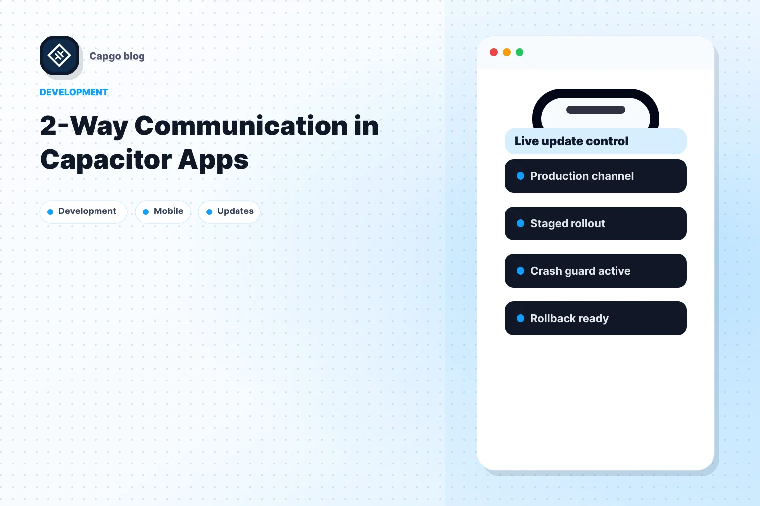
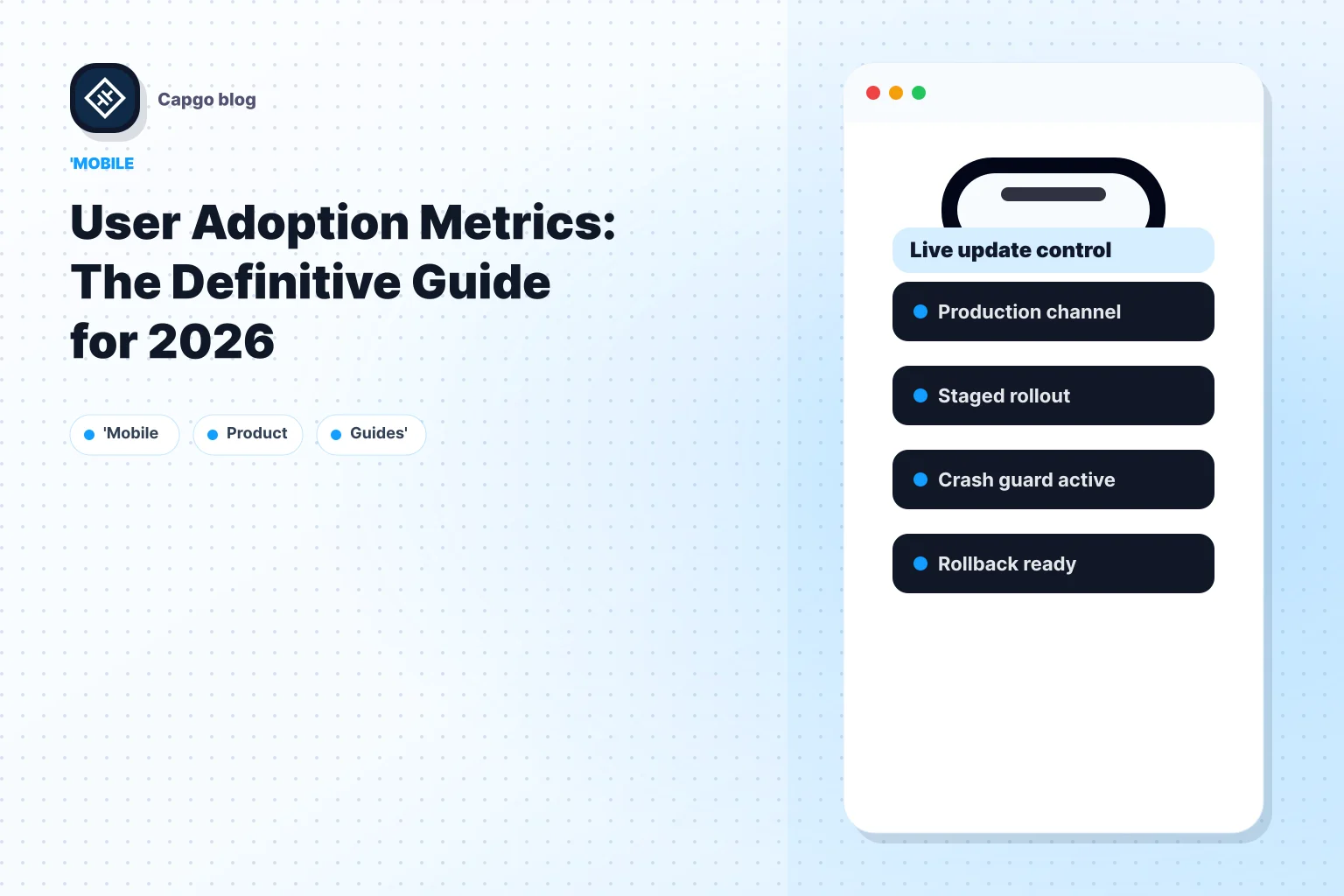
リリーススピードはここで重要です。製品チームは迅速なフィードバックループを通じて学習します。AmplitudeやMixpanelなどのツールは、ユーザーの行動を読むのに役立ちます。配信ツールは、ユーザーの行動とテストした変更を比較するのに役立ちます。モバイルとクロスプラットフォームのチームでは Capgo は、JavaScript、CSS、設定、コピー、資産の更新をアプリストアのレビューを待たずに配信するオプションです。これにより、採用問題を観察し、修正をテストするサイクルが短縮される可能性があります。
ワークフローの中盤では、デモ映像がチームが変更と理由を共有するのに役立ちます。
実用的な運営リズムは次のようになります:
- 週に1回ダッシュボードを確認してください。
- 1つの採用障壁を特定してください。
- 1つの焦点を置いた変更を実装してください。
- 前のコホートと次のコホートを比較してください。
- 行動、ではなく意見に基づいて、採用を維持するか取り消すかを判断してください。
採用の管理が実行可能になるのは、測定と製品アクションの定期的なループを確立することです。
AIとオートメーションを活用した採用指標の未来
AIは採用の指標の意味を複雑にしている。従来のユーザー採用指標では、人間がログインし、行動し、戻ってくるというモデルが想定されていました。しかし、このモデルは、AIエージェントがコンテンツを書き出し、ワークフローをトリガーする、またはタスクを自動的に完了する場合に不安定になります。
As Userpilotが採用測定の変更について書いた記事 新しいガイドラインではすでに、「人間vs. AIエージェント」という問題を指摘しています。実際の問題は簡単です。DAU/MAU、セッション時間、最初の重要なアクションまでの時間などの指標は、自動化によってではなく、人間が価値を実現するのではなく、自動化によって実行された場合でも、より強力に見えます。
チームは、よりきれいなAttributionが必要になります。タスクを開始したのは誰ですか? AIはどの部分をサポートしましたか? どの部分が完全に自動化されましたか? これらの区別は、オートメーションが通常の製品使用の一部になるにつれて、より重要になります。北極星は同じです。人間と組織が実際に、繰り返し価値を得ているかどうかを測定するのです。ただし、すべてのアクションが人間によって行われたと仮定することはできません。
あなたのチームが Capacitor または Electron アプリを配信し、採用分析と製品の変更の間のループをより緊密にすることを望む場合、 Capgo code を配信し、コンテンツの更新を迅速に提供し、特定のリリースチャンネルにターゲットし、ロールアウトの動作を監視して、採用が停滞した場合に製品、エンジニアリング、サポートが迅速に反応できるようにします。