
Introduction
Want to build a mobile app with Next.js from the ground up? This guide walks you through creating a brand new Next.js 15 project configured for mobile from day one, then packaging it as native iOS and Android apps using Capacitor 8.
By the end of this tutorial, you’ll have a working mobile app running on simulators that you can continue developing and eventually publish to the App Store and Google Play.
所需时间: ~30分钟
您将构建:
- 一个新的 Next.js 15 项目,带有 App Router
- 静态导出配置文件,适用于移动设备
- Capacitor 8,带有必需的插件
- 原生 iOS 和 Android 应用
- 实时重新加载开发环境
已经有一个 Next.js 应用了吗? 将您的 Next.js 应用转换为移动应用 而不是
前提条件
确保您已安装这些:
- Node.js 18+ (请检查
node --version) - Bun 包管理器(
curl -fsSL https://bun.sh/install | bash) - Xcode (仅macOS,用于iOS开发)
- Android Studio (用于Android开发)
步骤 1:创建一个新 Next.js 项目
首先创建一个新的 Next.js 15 项目:
bunx create-next-app@latest my-mobile-app当被提示时,请选择这些选项:
- TypeScript: 是(推荐)
- ESLint: 是
- Tailwind CSS: 是(推荐用于移动样式)
src/directory: 是- App Router: 是(推荐)
- Import alias: 默认(
@/*)
前往您的项目:
cd my-mobile-app步骤 2:配置 Next.js 静态导出
Capacitor 需要静态 HTML/JS/CSS 文件。通过更新 next.config.ts:
import type { NextConfig } from 'next';

const nextConfig: NextConfig = {
  output: 'export',
  images: {
    unoptimized: true,
  },
  // Ensure trailing slashes for proper routing in Capacitor
  trailingSlash: true,
};

export default nextConfig;
为什么这些设置?
output: 'export'— 生成静态 HTML 而不是需要 Node.js 服务器images: { unoptimized: true }— 禁用 Next.js 图像优化(需要服务器)trailingSlash: true— 确保在原生 WebView 中正确的路由
步骤 3:添加移动脚本
更新您的 package.json 以移动开发脚本:
{
  "scripts": {
    "dev": "next dev",
    "build": "next build",
    "start": "next start",
    "lint": "next lint",
    "mobile": "bun run build && bunx cap sync",
    "mobile:ios": "bun run mobile && bunx cap open ios",
    "mobile:android": "bun run mobile && bunx cap open android"
  }
}
测试构建:
bun run build您应该看到一个 out 静态文件所在的目录。
步骤 4: 安装 Capacitor 8
安装 Capacitor 核心包:
bun add @capacitor/core
bun add -D @capacitor/cli
安装大多数移动应用程序需要的必备插件:
bun add @capacitor/app @capacitor/keyboard @capacitor/splash-screen @capacitor/status-bar @capacitor/preferences这些插件的作用:
- @capacitor/app — 前台/后台应用生命周期事件(深度链接)
- @capacitor/keyboard — 控制键盘行为
- @capacitor/splash-screen — 原生启动屏幕控制
- @capacitor/status-bar — 设备状态栏样式
- @capacitor/preferences — 键值存储(类似 localStorage 但原生)
步骤 5:初始化 Capacitor
初始化 Capacitor 以及您的项目详细信息:
bunx cap init "My Mobile App" com.example.mymobileapp --web-dir out替换:
"My Mobile App"用您的应用程序显示名称com.example.mymobileapp用反向域名表示法的应用程序 ID
这会创建 capacitor.config.ts. 更新它以使用插件配置:
import type { CapacitorConfig } from '@capacitor/cli';

const config: CapacitorConfig = {
  appId: 'com.example.mymobileapp',
  appName: 'My Mobile App',
  webDir: 'out',
  plugins: {
    SplashScreen: {
      launchShowDuration: 2000,
      launchAutoHide: true,
      androidScaleType: 'CENTER_CROP',
      splashFullScreen: true,
      splashImmersive: true,
    },
    Keyboard: {
      resize: 'body',
      resizeOnFullScreen: true,
    },
    StatusBar: {
      style: 'light',
    },
  },
};

export default config;
步骤 6:添加原生平台
安装平台包:
bun add @capacitor/ios @capacitor/android生成本机项目:
bunx cap add ios
bunx cap add android
这将创建 ios 和 android 包含本机项目的目录。
第 7 步:构建和运行
构建您的项目并同步到本机平台:
bun run mobile在 iOS 模拟器中打开:
bun run mobile:ios或 Android 模拟器:
bun run mobile:android在 Xcode (iOS) 中:
- 从设备下拉菜单中选择一个模拟器
- 点击播放按钮或按
Cmd + R
在 Android Studio 中:
- 等待Gradle完成同步
- 从设备下拉菜单中选择一个模拟器
- 点击运行按钮或按
Shift + F10
步骤8:设置实时重载
为了更快的开发,启用实时重载,使设备上更改立即显示。
- 找到你的本地IP地址:
# macOS
ipconfig getifaddr en0

# Windows
ipconfig- 创建一个开发Capacitor配置。添加到
capacitor.config.ts:
import type { CapacitorConfig } from '@capacitor/cli';

const devConfig: CapacitorConfig = {
  appId: 'com.example.mymobileapp',
  appName: 'My Mobile App',
  webDir: 'out',
  server: {
    url: 'http://YOUR_IP_ADDRESS:3000',
    cleartext: true,
  },
  plugins: {
    // ... same plugin config
  },
};

const prodConfig: CapacitorConfig = {
  appId: 'com.example.mymobileapp',
  appName: 'My Mobile App',
  webDir: 'out',
  plugins: {
    // ... same plugin config
  },
};

const config = process.env.NODE_ENV === 'development' ? devConfig : prodConfig;

export default config;- 启动开发服务器并复制配置到原生:
bun run dev &
NODE_ENV=development bunx cap copy- 在Xcode/Android Studio中重建
现在,你的Next.jscode的编辑将在设备上实时重载。
步骤9:创建第一个移动屏幕
让我们创建一个简单的移动友好的主屏幕。更新 src/app/page.tsx:
'use client';

import { useEffect, useState } from 'react';
import { App } from '@capacitor/app';
import { Keyboard } from '@capacitor/keyboard';

export default function Home() {
  const [appInfo, setAppInfo] = useState<{ name: string; version: string } | null>(null);

  useEffect(() => {
    // Get app info on mount
    App.getInfo().then(setAppInfo).catch(console.error);

    // Handle back button on Android
    const backHandler = App.addListener('backButton', ({ canGoBack }) => {
      if (!canGoBack) {
        App.exitApp();
      } else {
        window.history.back();
      }
    });

    // Hide keyboard when tapping outside inputs
    const keyboardHandler = Keyboard.addListener('keyboardWillShow', () => {
      document.body.classList.add('keyboard-open');
    });

    return () => {
      backHandler.then(h => h.remove());
      keyboardHandler.then(h => h.remove());
    };
  }, []);

  return (
    <main className="min-h-screen bg-linear-to-b from-blue-500 to-blue-700 flex flex-col items-center justify-center p-6 text-white">
      <h1 className="text-4xl font-bold mb-4">My Mobile App</h1>
      <p className="text-xl mb-8 text-center opacity-90">
        Built with Next.js 15 + Capacitor 8
      </p>

      {appInfo && (
        <div className="bg-white/20 rounded-lg p-4 backdrop-blur-sm">
          <p className="text-sm">
            {appInfo.name} v{appInfo.version}
          </p>
        </div>
      )}

      <div className="mt-12 space-y-4 w-full max-w-sm">
        <button className="w-full py-4 px-6 bg-white text-blue-600 rounded-xl font-semibold text-lg shadow-lg active:scale-95 transition-transform">
          Get Started
        </button>
        <button className="w-full py-4 px-6 bg-white/20 text-white rounded-xl font-semibold text-lg backdrop-blur-sm active:scale-95 transition-transform">
          Learn More
        </button>
      </div>
    </main>
  );
}
第 10 步:添加安全区域处理
移动设备有凹槽、主屏幕指示器和状态栏。使用 Tailwind 添加安全区域处理。
更新 src/app/globals.css:
@tailwind base;
@tailwind components;
@tailwind utilities;

:root {
  --sat: env(safe-area-inset-top);
  --sar: env(safe-area-inset-right);
  --sab: env(safe-area-inset-bottom);
  --sal: env(safe-area-inset-left);
}

body {
  padding-top: var(--sat);
  padding-right: var(--sar);
  padding-bottom: var(--sab);
  padding-left: var(--sal);
}

/* Prevent text selection on mobile */
* {
  -webkit-user-select: none;
  user-select: none;
  -webkit-tap-highlight-color: transparent;
}

/* Allow text selection in inputs */
input, textarea {
  -webkit-user-select: auto;
  user-select: auto;
}

/* Keyboard handling */
.keyboard-open {
  --sab: 0px;
}
项目结构
您的项目现在应该如下所示:
my-mobile-app/
├── android/              # Android native project
├── ios/                  # iOS native project
├── out/                  # Static build output
├── src/
│   ├── app/
│   │   ├── globals.css
│   │   ├── layout.tsx
│   │   └── page.tsx
│   └── ...
├── capacitor.config.ts   # Capacitor configuration
├── next.config.ts        # Next.js configuration
├── package.json
└── ...
下一步
您现在有一个工作的 Next.js 移动应用。接下来要做的事情是:
必备设置
- 应用图标: 替换默认图标在
ios/App/App/Assets.xcassets和android/app/src/main/res - 启动屏幕: 自定义原生项目或使用
@capacitor/splash-screen配置 - 深度链接: 配置 URL 方案以便于您的应用
添加更多功能
- 相机:
bun add @capacitor/camera - 地理位置:
bun add @capacitor/geolocation - 推送通知:
bun add @capacitor/push-notifications - 文件系统:
bun add @capacitor/filesystem
原生 UI 和过渡
使用 Capgo 插件而不是 Konsta UI 来获得原生移动体验:
- @capgo/capacitor-native-navigation — Liquid Glass tab bar 和原生导航栏
- @capgo/capacitor-transitions — 原生感知的页面过渡
bun add @capgo/capacitor-native-navigation @capgo/capacitor-transitions
bunx cap sync
为 Tailwind 安全区域添加 @capgo/tailwind-capacitor:
bun add -D tailwind-capacitor查看 使用 @capgo/capacitor-native-navigation, 使用 @capgo/capacitor-transitions和 tailwind-capacitor 仓库
用于 Next.js 特定设置。修复 iOS 布局问题(视口、安全区域和水平溢出)
If content looks cropped, shifted, or horizontally scrollable on iOS, adding more overflow-x: hidden or tweaking the viewport tag alone usually does not fix it. Work through these checks in order.
确保视口元标签正确应用
App Router (app/): export viewport from app/layout.tsx:
import type { Viewport } from 'next';

export const viewport: Viewport = {
  width: 'device-width',
  initialScale: 1,
  viewportFit: 'cover',
};
Pages Router (pages/): 将视口元标签放在 pages/_app.tsx, not _document.tsx.
iOS 安全区域处理应从一个根容器中进行
创建一个单独的应用壳并在其中应用安全区域填充 — 不要在多个嵌套组件中:
html,
body,
#__next {
  width: 100%;
  min-height: 100%;
  margin: 0;
  padding: 0;
  overflow-x: hidden;
}

* {
  box-sizing: border-box;
}

.app-shell {
  min-height: 100dvh;
  width: 100%;
  padding-top: env(safe-area-inset-top);
  padding-right: env(safe-area-inset-right);
  padding-bottom: env(safe-area-inset-bottom);
  padding-left: env(safe-area-inset-left);
}
将所有页面内容都放在 .app-shell. 在头部、模态窗口和布局包装中重复的安全区域填充经常会使 UI 看起来被裁剪或过大。
使用 @capgo/tailwind-capacitor, pt-safe pb-safe px-safe ,你可以用
Set Capacitor iOS contentInset 将 __CAPGO_KEEP_0__ iOS never 设置为
首选 capacitor.config.ts在 contentInsetMode: 'css',优先使用原生 inset 禁用并让 CSS (或 Native Navigation 的)
const config: CapacitorConfig = {
  appId: 'com.example.myapp',
  appName: 'my-app',
  webDir: 'out',
  ios: {
    contentInset: 'never',
  },
};
Mixing Capacitor’s automatic content inset with CSS env(safe-area-inset-*) 填充是双倍间距的常见原因。
找到真正溢出的元素
通常的凶手是使用 100vw, Tailwind w-screen, 固定像素宽度, 或 min-width.
在 Safari Web Inspector 中运行:
[...document.querySelectorAll('*')]
  .filter(el => el.scrollWidth > document.documentElement.clientWidth)
  .map(el => ({
    el,
    tag: el.tagName,
    class: el.className,
    scrollWidth: el.scrollWidth,
    clientWidth: document.documentElement.clientWidth,
  }));
使用 Tailwind 替换 w-screen 当可能时, w-full 许多水平溢出问题来自 100vw / w-screen, 重复的安全区域填充, 或固定宽度容器 — 而不是来自视口元标签本身。
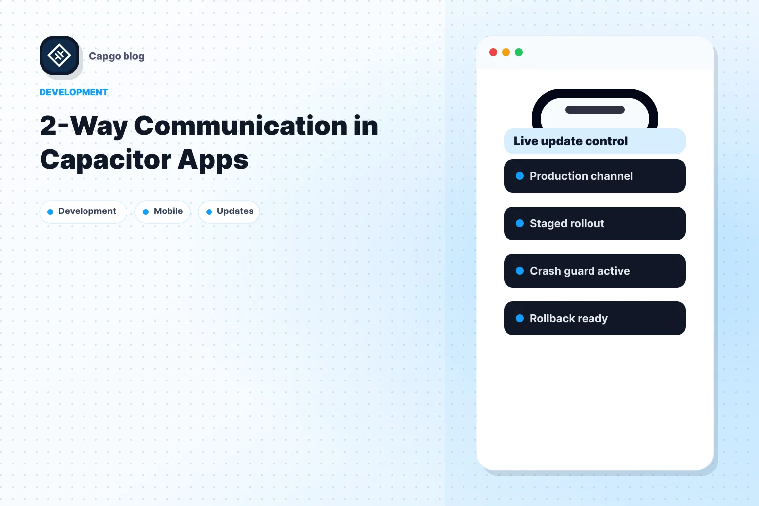
无线更新
设置 Capgo 不需要重新发布应用商店:
bunx @capgo/cli init故障排除
构建失败:找不到模块
运行 bun install 并尝试再次构建.
iOS:找不到签名身份 打开Xcode,转到签名和能力,选择您的开发团队.
Android:找不到SDK位置
创建 android/local.properties 与 sdk.dir=/path/to/android/sdk
设备上未显示的更改
确保你已经运行 bun run mobile 修改后,为了实时重载,请检查 IP 地址是否正确并且开发服务器正在运行。
资源
- Capacitor 8 文档
- Next.js 15 文档
- Capgo - 实时更新
- @capgo/capacitor-原生导航
- @capgo/capacitor-过渡
- @capgo/tailwind-capacitor
准备好将你的应用程序交付了吗?了解如何使用 Capgo 快速交付更新 — 注册免费账户 今天
Keep going from Build a Next.js Mobile App from Scratch with Capacitor 8
如果您正在使用 Build a Next.js Mobile App from Scratch with Capacitor 8 为了计划 CI/CD 自动化,连接它与 Capgo CI/CD 在 Capgo CI/CD 中为产品流程 Capgo 原生构建 在 Capgo 原生构建中为产品流程 Capgo 集成 在 Capgo 集成中为产品流程 CI/CD 集成 在 CI/CD 集成中实现详细信息 GitHub Actions Integration 为GitHub Actions Integration 的实施细节。