Vous vous trouvez probablement dans l'une ou l'autre des situations suivantes. Soit vous avez besoin d'une façon propre pour afficher quelques actions contextuelles sans encombrer votre écran avec des boutons supplémentaires, soit vous avez déjà déployé une feuille d'actions ionic et découvert que la version de démonstration facile n'est pas la même chose qu'une mise en œuvre prête à la production.
Cette lacune compte. Une feuille d'actions semble simple, mais elle se situe à l'intersection du design d'interaction, des API de framework, du comportement du plateau, de l'accessibilité et de la maintenance post-lancement. Si vous ne la traitez que comme une fenêtre de popup avec des boutons, vous manquerez les parties qui cassent généralement tard en QA.
Table des matières
- Introduction à la feuille d'actions Ionic
- Comprendre le Contrôleur de la feuille d'action et API
- Exemples d'implémentation pour Angular, React et Vue
- Personnalisation et style avec CSS
- Suivi des sujets avancés et considérations de plateforme
- Péchés de dépannage et corrections de mise à jour UI en direct
Introduction à la feuille d'action Ionique
La feuille d'action Ionique est l'outil approprié lorsque l'utilisateur doit effectuer une petite décision ciblée liée au contexte actuel. Supprimer un brouillon. Remplacer une photo de profil. Enregistrer, partager ou archiver un document. Ces actions sont importantes, mais elles ne méritent pas d'occuper un espace permanent dans la disposition principale.
Dans Ionique, le modèle a resté cohérent pendant longtemps. Les anciens applications Ionique utilisaient le $ionicActionSheet service, que TutorialsPoint décrit comme une fenêtre qui s'ouvre en glissant depuis le bas de l'écran et qui est affichée en injectant le service et en appelant show() dans le contrôleur. Les applications modernes utilisent ion-action-sheet, mais le modèle d'interaction est toujours reconnaissable, ce qui fait que le composant est l'un des exemples les plus clairs de Ionic qui préserve les modèles d'interface utilisateur mobiles à travers les générations de frameworks dans la synthèse de la documentation de la feuille d'action Ionic 1 de TutorialsPoint.
Cette continuité est utile dans les projets réels. Cela signifie que le composant n'est pas une abstraction tendance qui a changé à chaque mise à jour. C'est un modèle mobile stable qui se mappent bien aux menus d'options iOS et Android, et il se sent toujours naturel dans les projets Angular, React et Vue.
Pourquoi les équipes continuent à s'y raccrocher
Une feuille d'action fonctionne bien lorsque l'utilisateur comprend déjà le contexte et n'a besoin que d'une liste compacte de prochaines étapes. Elle fonctionne mal lorsque l'utilisateur a besoin d'une explication, d'une validation ou de plusieurs champs de formulaire.
Une règle simple aide à décider :
- Utilisez une feuille d'action pour les menus de décision courts liés à un élément spécifique.
- Utilisez un avertissement lorsque vous avez besoin de confirmation avec des options minimales.
- Utilisez un modèle When l'utilisateur a besoin de plus de contenu, d'entrées ou de défilement.
Règle pratique : Si les étiquettes de bouton ne peuvent pas se tenir seules sans texte de paragraphe supplémentaire, n'imposez pas l'interaction dans un feuillet d'actions.
Dans les applications hybrides, ce modèle s'insère également facilement dans le modèle web-natif. L'interface utilisateur est simple au point de pouvoir être rendue dans la couche web, tout en ressentant comme native sur les appareils tactiles. Si votre équipe construit sur Capacitor et souhaite une représentation mentale plus claire de cette frontière, ce détail de la manière dont Capacitor relie le web et le natif __CAPGO_KEEP_1__ est utile à garder à l'esprit pendant que vous décidez où le feuillet d'actions devrait vivre. how Capacitor bridges web and native code Le feuillet d'actions devient facile à raisonner une fois que vous cessez de le considérer comme juste un autre composant inline. Il se comporte plus comme un surcouche temporaire avec un cycle de vie. Vous le créez, vous le présentez, vous attendez l'utilisateur, et puis vous gérez le résultat après la fermeture.
Un diagramme de flux expliquant l'architecture, la configuration et les API composants d'un Contrôleur de Feuillet d'Actions.
Pourquoi le __CAPGO_KEEP_0__ est piloté par un contrôleur

Why the API is controller driven
__CAPGO_KEEP_0__
__CAPGO_KEEP_1__ boîte de dialogue modale qui nécessite la validation de l'utilisateur, et ils accordent beaucoup d'importance aux méthodes de cycle de vie de la validation onDidDismiss pour la logique d'après-sélection dans le Feuille d'action Ionique API docs. Cette conception vous indique comment structurer votre code. Présentez d'abord. Réagissez ensuite à la validation. N'associez pas de logique critique à des hypothèses sur le timing.
Les options qui comptent vraiment
La plupart des équipes n'ont besoin que d'un petit sous-ensemble des API, mais elles doivent utiliser correctement ce sous-ensemble.
| Option | Ce qu'il fait | Pourquoi cela compte |
|---|---|---|
header |
Définit l'étiquette supérieure | Bon pour le contexte lorsque les actions pourraient être ambiguës |
subHeader |
Ajoute un texte secondaire | Utile lorsque les actions nécessitent une clarification légère |
buttons |
Définit les actions disponibles | C'est là où vivent la comportement et l'accent visuel |
cssClass |
Ajoute des classes personnalisées | Essentiel pour le style scoping au lieu de trucs globaux |
mode |
Force le style iOS ou MD | Utile pour des tests contrôlés sur plusieurs plateformes |
La configuration du bouton est là où les erreurs se produisent généralement. Un bouton typique peut inclure :
textpour l'étiquette visible.iconsi vous souhaitez une indication visuelle.handlerpour la logique de rappel immédiate.rolepour le comportement sémantique et la mise en page du plateau.
role n'est pas décoratif. Utilisez destructive pour les actions dangereuses comme la suppression. Utilisez cancel pour le chemin d'échappement. Ces rôles affectent la façon dont le feuille de route présente les choix et la façon dont les utilisateurs lisent la liste sous pression.
Les actions dangereuses appartiennent à la limite du jeu de choix, et non mélangées aux actions neutres avec le même poids visuel.
Le rejet fait partie du contrat
Un bug commun se présente comme ceci : un développeur ouvre une feuille de route, suppose que le résultat du gestionnaire est suffisant, puis déclenche la navigation ou les mises à jour d'état avant que l'overlay n'ait complètement disparu. Cela peut produire des transitions floues, des états viciés ou des conditions de course dans les tests.
Utilisez le cycle de vie intentionnellement :
- Créez la feuille.
await present().await onDidDismiss().- Lisez le rôle retourné ou les données.
- Déclenchez la prochaine action.
Ce modèle est ennuyeux, et c'est pourquoi il fonctionne.
Voici un exemple en style Angular de la forme :
const sheet = await this.actionSheetController.create({
  header: 'Photo options',
  buttons: [
    {
      text: 'Take Photo',
      icon: 'camera',
      handler: () => {
        console.log('take photo');
      }
    },
    {
      text: 'Delete Photo',
      role: 'destructive',
      icon: 'trash'
    },
    {
      text: 'Cancel',
      role: 'cancel'
    }
  ]
});

await sheet.present();

const result = await sheet.onDidDismiss();
console.log('dismissed with role:', result.role);
Si vous vous souvenez d'une seule chose de la API, rappellez-vous ceci : une feuille d'action ionic n'est pas terminée lorsqu'elle apparaît. C'est terminé lorsqu'elle se ferme.
Exemples d'implémentation pour Angular React et Vue
Le modèle mental ne change pas d'une version à l'autre, mais la syntaxe change. Chaque version crée la même interaction : l'utilisateur clique sur l'avatar, voit des options pour la photo de profil, choisit une action et l'application répond après que l'overlay se ferme.

Si vous gérez également les états hors ligne pour les téléchargements de médias, ce guide sur la création d'une écran hors ligne en Vue Angular React s'harmonise bien avec les exemples ci-dessous car les actions photo mènent souvent directement à des flux dépendants du réseau.
Exemple Angular
Dans Ionic Angular, l'approche la plus courante consiste à injecter ActionSheetController dans le composant ou la page.
import { Component } from '@angular/core';
import { ActionSheetController } from '@ionic/angular';

@Component({
  selector: 'app-profile-photo',
  template: `
    <ion-button expand="block" (click)="openPhotoActions()">
      Profile Photo Options
    </ion-button>
  `
})
export class ProfilePhotoComponent {
  constructor(private actionSheetController: ActionSheetController) {}

  async openPhotoActions() {
    const actionSheet = await this.actionSheetController.create({
      header: 'Profile photo',
      subHeader: 'Choose what to do next',
      buttons: [
        {
          text: 'Take Photo',
          icon: 'camera',
          handler: () => {
            console.log('Open camera flow');
          }
        },
        {
          text: 'Choose from Library',
          icon: 'images',
          handler: () => {
            console.log('Open photo library flow');
          }
        },
        {
          text: 'Remove Current Photo',
          role: 'destructive',
          icon: 'trash',
          handler: () => {
            console.log('Remove current photo');
          }
        },
        {
          text: 'Cancel',
          role: 'cancel'
        }
      ]
    });

    await actionSheet.present();

    const { role } = await actionSheet.onDidDismiss();
    console.log('Action sheet dismissed with role:', role);
  }
}
Les équipes Angular se trompent généralement dans l'un ou l'autre de deux endroits. Elles déplacent soit trop de logique dans les gestionnaires de boutons, soit elles oublient que la promesse de rejet est le lieu plus sûr pour coordonner les transitions d'interface.
Exemple React
Dans Ionic React, useIonActionSheet vous donnez un API fonctionnel compact qui s'intègre naturellement avec les gestionnaires d'événements.
import React from 'react';
import { IonButton, useIonActionSheet } from '@ionic/react';

const ProfilePhotoActions: React.FC = () => {
  const [presentActionSheet] = useIonActionSheet();

  const openPhotoActions = () => {
    presentActionSheet({
      header: 'Profile photo',
      subHeader: 'Choose what to do next',
      buttons: [
        {
          text: 'Take Photo',
          icon: 'camera',
          handler: () => {
            console.log('Open camera flow');
          }
        },
        {
          text: 'Choose from Library',
          icon: 'images',
          handler: () => {
            console.log('Open photo library flow');
          }
        },
        {
          text: 'Remove Current Photo',
          role: 'destructive',
          icon: 'trash',
          handler: () => {
            console.log('Remove current photo');
          }
        },
        {
          text: 'Cancel',
          role: 'cancel'
        }
      ],
      onDidDismiss: (event) => {
        console.log('Dismissed with role:', event.detail.role);
      }
    });
  };

  return (
    <IonButton expand="block" onClick={openPhotoActions}>
      Profile Photo Options
    </IonButton>
  );
};

export default ProfilePhotoActions;
React’s hook API is ergonomic, but the same rule applies. Keep the immediate handler focused on the chosen action. Use dismissal callbacks for cleanup, analytics, or follow-up UI state.
Exemple Vue
Dans Ionic Vue, actionSheetController fonctionne proprement à l'intérieur de la composition API.
<template>
  <ion-button expand="block" @click="openPhotoActions">
    Profile Photo Options
  </ion-button>
</template>

<script setup lang="ts">
import { IonButton, actionSheetController } from '@ionic/vue';

const openPhotoActions = async () => {
  const actionSheet = await actionSheetController.create({
    header: 'Profile photo',
    subHeader: 'Choose what to do next',
    buttons: [
      {
        text: 'Take Photo',
        icon: 'camera',
        handler: () => {
          console.log('Open camera flow');
        }
      },
      {
        text: 'Choose from Library',
        icon: 'images',
        handler: () => {
          console.log('Open photo library flow');
        }
      },
      {
        text: 'Remove Current Photo',
        role: 'destructive',
        icon: 'trash',
        handler: () => {
          console.log('Remove current photo');
        }
      },
      {
        text: 'Cancel',
        role: 'cancel'
      }
    ]
  });

  await actionSheet.present();

  const result = await actionSheet.onDidDismiss();
  console.log('Dismissed with role:', result.role);
};
</script>
Une différence pratique dans les projets Vue est où vous gardez les effets secondaires. Si votre application utilise des composables pour la logique de la caméra ou du sélectionneur de fichiers, appelez ceux-ci depuis les gestionnaires et laissez le contrôleur code mince.
Gardez votre code spécifique à la plateforme petite. La logique commerciale pour la caméra, l'importation, la suppression et les analyses doit vivre à l'extérieur de la configuration de la feuille d'action.
Personnalisation et Styling avec CSS
La mise en page par défaut de la feuille d'action ionic est généralement suffisante pour un prototype. Ce n'est pas toujours suffisant pour une application personnalisée, et ce n'est certainement pas suffisant lorsque le design veut une mise en page plus serrée, une typographie différente ou une action destructive plus évidente.

Si votre équipe essaie de faire en sorte que toute l'application ait l'air moins comme un enveloppe web générique et plus comme un produit natif, cet article sur la configuration de base JS et CSS pour un look d'application native est un compagnon utile à la personnalisation de la feuille d'actions.
Commencez par cssClass avant les surcharges globales.
La première règle de style est simple. Ne ciblez pas tous les feuilles d'actions de l'application à moins que vous ne le vouliez vraiment. Utilisez cssClass pour scoper une variante particulière.
const sheet = await actionSheetController.create({
  header: 'File actions',
  cssClass: 'file-actions-sheet',
  buttons: [
    { text: 'Rename' },
    { text: 'Delete', role: 'destructive' },
    { text: 'Cancel', role: 'cancel' }
  ]
});
Stylez ensuite uniquement cette instance :
.file-actions-sheet {
  --background: #101418;
  --color: #f5f7fa;
  --backdrop-opacity: 0.4;
}
Cette approche s'adapte mieux que de poursuivre les sélecteurs plus tard.
Utilisez des propriétés personnalisées pour un thème large.
Les propriétés CSS personnalisées sont la façon la plus rapide de changer l'ambiance générale sans se battre avec la structure du composant.
Les cas d'utilisation courants incluent :
- couleur de fond et de texte lorsque votre application a un thème personnalisé sombre.
- opacité de l'arrière-plan lorsque le dimmage par défaut vous semble trop faible ou trop lourd.
- espacement et taille lorsque la densité visuelle doit correspondre au reste de votre interface.
.file-actions-sheet {
  --background: #1b1f24;
  --color: #ffffff;
  --backdrop-opacity: 0.32;
  --button-color: #dce3ea;
  --button-background-hover: #2a3138;
}
Utilisez les parties d'ombre lorsque vous avez besoin de précision
Une fois que le design demande des changements ciblés, les propriétés personnalisées peuvent ne pas suffire. C'est là que les parties d'ombre entrent en jeu. Elles vous permettent de personnaliser les zones internes du menu de choix plus directement.
.file-actions-sheet::part(container) {
  border-radius: 18px 18px 0 0;
  box-shadow: 0 10px 30px rgba(0, 0, 0, 0.24);
}

.file-actions-sheet::part(button) {
  font-weight: 600;
  letter-spacing: 0.01em;
}

.file-actions-sheet::part(backdrop) {
  backdrop-filter: blur(4px);
}
Ce qui ne fonctionne généralement pas bien, c'est sur-styliser le composant jusqu'à ce qu'il ne ressemble plus à un menu de choix système. Si vous avez besoin de cartes riches, de miniatures, de descriptions longues ou de dispositions de ligne complexes, vous avez dépassé le modèle du menu de choix.
Une bonne passe de personnalisation devrait faire en sorte que le composant corresponde à votre application, et non qu'il dissimule ce qu'il est.
Sujets avancés et considérations de plateforme
Les feuilles de décision de production vivent dans un espace de décision plus vaste que la plupart des tutoriels ne l'admettent. Vous ne choisissez pas seulement les étiquettes des boutons. Vous décidez si l'overlay doit être rendu par la couche web d'Ionic ou délégué à l'interface native, combien de comportement spécifique à la plateforme vous souhaitez, et comment vous pouvez vous assurer que la feuille reste compréhensible pour tous les utilisateurs.

Composant web ou plugin natif
Si vous construisez une application Ionic standard, ion-action-sheet est généralement la valeur par défaut. C'est flexible, facile à personnaliser et fonctionne de manière cohérente avec le reste du système de surcouche de votre application.
Si votre application est basée sur Capacitor et que vous souhaitez que le système d'exploitation hôte affiche la feuille, la route native est @capacitor/action-sheetLes documents d'Ionic mentionnent le plugin autour de showActions(options) -> Promise<ShowActionsResult>, installé avec npm install @capacitor/action-sheet , synchronisé avec npx cap sync, tout en notant que Les éléments PWA sont nécessaires dans les contextes web et PWA dans le Capacitor plugin de feuille d'action.
Cela vous donne une table de compromis pratique :
| Choix | Force | Coût |
|---|---|---|
ion-action-sheet |
Thématique plus facile et modèles de l'interface web partagés | Moins de fidélité native |
@capacitor/action-sheet |
Rendu de l'OS hôte et un sentiment de plateforme plus fort | Plus de contraintes d'implémentation dans les contextes de navigateur et de PWA |
Utilisez le composant web lorsque la cohérence visuelle avec votre application compte plus. Utilisez le plugin natif lorsque la fidélité de la plateforme compte plus que le contrôle CSS profond.
Mode de plateforme et détails d'accessibilité
Ionic peut s'adapter aux modes iOS et Material Design, et cela affecte l'espace, la motion et le ton visuel global. N'assumez pas que votre stylage se comporte de la même manière dans les deux modes. Testez-les intentionnellement, surtout si votre équipe impose un mode unique sur toutes les plateformes.
L'accessibilité est également négligée car les feuilles d'action semblent petites. Les bases restent importantes :
- Utilisez des boutons de texte clairs qui ont un sens hors de contexte.
- Réservez
destructivepour les actions risquées afin que l'interface communique son intention. - Gardez
canceldes informations explicites afin que l'utilisateur ait un chemin de sortie clair. - Évitez l'ambiguïté décorative où plusieurs actions semblent similaires mais ont des résultats très différents.
Un utilisateur avec un lecteur d'écran ou des contraintes de charge cognitive n'expérimente pas les « surcouches » simples comme simples si les étiquettes sont vagues.
Le point acéré ici est que les approches natives et web résolvent des problèmes différents. La composante web vous donne plus de contrôle sur l'apparence et l'intégration. Le plugin natif vous donne une meilleure alignement sur la plateforme. Rien n'est automatiquement meilleur. La bonne réponse dépend de savoir si votre douleur actuelle d'application est la cohérence visuelle, la vitesse d'implémentation ou le comportement natif du système.
Problèmes de dépannage et correction de fixes de l'interface utilisateur en direct
La plupart des bogues de feuille d'actions ionic ne se manifestent pas lorsque vous configurez trois boutons et que vous les testez en les faisant glisser dans un simulateur. Ils apparaissent plus tard, lorsque la feuille est stylisée, testée sur des appareils plus récents et combinée avec la navigation et les transitions d'état réelles.
Les bogues qui apparaissent après le démo fonctionne
La première classe de bogue est le timing. La logique s'exécute trop tôt car le code n'attend pas la fermeture. Vous voyez les changements de route pendant que l'overlay est encore en train d'animer, ou les mises à jour d'état qui se disputent avec le rendu d'un autre composant.
La deuxième classe est la disposition. Un problème connu d'Ionic rapporte que la feuille d'actions peut chevaucher la zone de sécurité inférieure sur certains appareils iOS, notamment lorsque --ion-safe-area-bottom n'est pas nul, et le rapport de problème note qu'il peut même être reproduit dans la démo des docs d'Ionic sur le GitHub problème de chevauchement de la zone de sécurité inférieure. Il s'agit exactement du genre de problème que les équipes manquent jusqu'à la fin de la phase QA car il dépend de la forme de l'appareil, du mode et du CSS personnalisé.
Une solution pratique de zone de sécurité
Si votre application affiche la feuille trop près de la zone d'indicateur de maison, commencez par une modification étendue plutôt qu'une modification globale.
.safe-area-sheet::part(container) {
  padding-bottom: calc(env(safe-area-inset-bottom) + 8px);
}
Ensuite, appliquez la classe lors de la création de la feuille d'actions :
const sheet = await actionSheetController.create({
  header: 'More actions',
  cssClass: 'safe-area-sheet',
  buttons: [
    { text: 'Archive' },
    { text: 'Delete', role: 'destructive' },
    { text: 'Cancel', role: 'cancel' }
  ]
});
Cela ne remplacera pas les tests d'appareil, mais cela vous donne un endroit concret pour commencer sans modifier chaque overlay de l'application.
Why les mises à jour en temps réel ont de l'importance pour les défauts d'interface utilisateur
Les réalités pratiques des opérations de mise en production deviennent évidentes. Une regression de la zone de sécurité, une règle de padding brisée ou une couleur de bouton destructeur incorrecte vit souvent dans JavaScript ou CSS. Si ce bug est expédié en production, attendre une mise à jour complète de l'application peut transformer un petit défaut visuel en jours de frustration pour les utilisateurs.
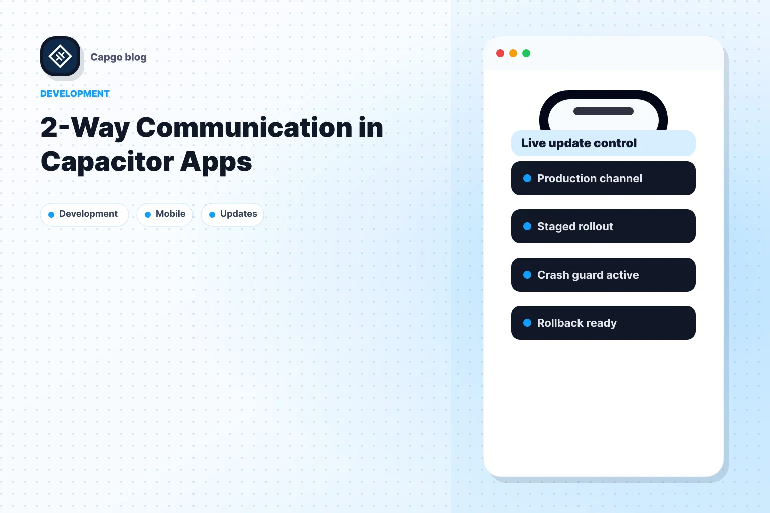
Une option pratique est un service de mise à jour en temps réel pour les applications Capacitor. Capgo livre des paquets web mis à jour afin que les équipes puissent expédier les correctifs de JavaScript, CSS, de copie, de configuration et d'actifs sans attendre la revue de l'application sur l'app store, ce qui est directement pertinent lorsque qu'un bug de style d'action ou d'overlay glisse entre les mains de la QA.
Les surimpressions d'interface sont exactement le type de fonctionnalité où ce filet de sécurité paye de ses effets. Elles sont très visibles, faciles à briser avec de petites modifications de style et généralement réparables sans reconstruire nativement code.
Si votre équipe expédie régulièrement des applications Ionic ou Capacitor Capgo est digne d'être évalué en tant que partie intégrante de votre flux de mise en production. Cela vous donne un moyen de pousser les correctifs de la couche web pour les problèmes comme les bugs de mise en page de l'action sheet, les régressions de style et les erreurs de copie après la mise en production, tout en gardant le contrôle sur les canaux de mise à jour et le comportement de mise à jour.
Continuez de la guide complet d'action Ionic : 2026
Si vous utilisez Guide complet d'action Ionic : 2026 planifier la migration et les opérations d'entreprise, connectez-le à Capgo Entreprise pour le flux de travail du produit dans Capgo Entreprise, Alternatives d'extension d'entreprise d'Ionic pour le flux de travail du produit dans Alternatives d'extension d'entreprise d'Ionic, Capgo Alternatives pour le flux de travail du produit dans Capgo Alternatives, Capgo Conseil pour le flux de travail du produit dans Capgo Conseil, et Capgo Support Premium pour le flux de travail du produit dans Capgo Support Premium.