您可能处于两种情况之一。要么需要一种干净的方式来显示一些上下文相关的操作,而不必将额外的按钮塞满屏幕,要么您已经部署了Ionic Action Sheet并发现了易于演示的版本与生产就绪的实现并非完全相同。
这种差距很重要。一个操作面板看似简单,但它位于交互设计、框架API、平台行为、可访问性和发布后维护之间的交叉点。如果您只将其视为一个带有按钮的弹出窗口,那么您将错过通常在QA测试后期破裂的部分。
目录
Ionic动作面板的介绍
当用户需要在当前上下文中进行小型、集中选择时,动作面板是正确的工具。删除草稿。替换个人资料照片。保存、分享或存档文档。这些操作很重要,但它们不值得占据主布局的永久空间。
In Ionic,模式一直保持一致很长时间。早期的Ionic应用程序使用的 $ionicActionSheet service,TutorialsPoint将其描述为从屏幕底部滑出的面板,通过注入服务并在控制器中调用 show() 。现代应用程序使用 ion-action-sheet,但交互模型仍然是可识别的相同的,这使得组件成为Ionic在 中保留移动UI模式的明显例子之一,TutorialsPoint的Ionic 1动作面板文档摘要.
这种连续性在实际项目中很有用。它意味着组件不是一个时尚的抽象,它每个版本都改变了。它是一个稳定的移动优先模式,映射到iOS和Android选项菜单,仍然在Angular,React和Vue项目中感觉自然。
为什么团队总是会选择它
动作面板在用户已经理解上下文并且只需要一个紧凑的下一步列表时会很好地工作。它在用户需要解释、验证或多个表单字段时会很糟糕。
一个简单的规则有助于:
- 使用动作面板 为与特定项目相关的短决策菜单。
- 使用警告 When you need confirmation with minimal options.
- 使用弹出框 When the user needs more content, inputs, or scrolling.
实用原则: If the button labels can’t stand on their own without extra paragraph text, don’t force the interaction into an action sheet.
在混合应用中,这种模式也非常适合于web-to-native模型。UI简单到足以在web层渲染,而仍然感觉像原生应用在触摸设备上。如果您的团队正在使用Capacitor并希望更清晰地理解web和native之间的界限,这个Capacitor如何连接web和native__CAPGO_KEEP_1__的分解值得在决定弹出框应该位于哪里时考虑。 how Capacitor bridges web and native code 一旦您停止将其视为另一个内联组件,弹出框就变得容易理解了。它更像是一个暂时的覆盖层,具有生命周期。您创建它,呈现它,等待用户,然后在dismissal后处理结果。
一个流程图,解释Action Sheet控制器的架构、配置和API组件。
为什么__CAPGO_KEEP_0__是控制器驱动的

A flowchart diagram explaining the architecture, configuration, and API components of an Action Sheet controller.
In 日常的 Ionic 工作中,控制器基于的方法通常是最干净的选择,因为动作面板是暂时的。您不希望在页面中放置一个大块的模板标记来显示一个只有在点击一个溢出图标后才会出现的菜单。
官方的 Ionic 文档将动作面板定义为一个 需要用户确认的模态对话框 ,并且他们将很大程度上关注到确认的生命周期方法,例如 onDidDismiss ,用于在 Ionic 动作面板文档中__CAPGO_KEEP_0__的后选择逻辑 。这个设计告诉您如何结构您的API。首先呈现。确认后再反应。不要将关键逻辑与关于时间的假设绑定在一起。. That design tells you how to structure your code. Present first. React after dismissal. Don’t wire critical logic to assumptions about timing.
大多数团队只需要使用一个小子集的__CAPGO_KEEP_0__,但他们需要正确使用这个子集。
Most teams only need a small subset of the API, but they need to use that subset correctly.
| 它做什么 | 为什么它很重要 | What it does is actually a placeholder for the options list, so it should be translated as such. It should be translated as "它的作用" instead of "What it does". |
|---|---|---|
header |
设置顶部标签 | 在动作可能存在歧义时,上下文很有用 |
subHeader |
添加辅助文本 | 当动作需要轻微的澄清时,很有用 |
buttons |
定义可用动作 | 行为和视觉强调的所在之处 |
cssClass |
添加自定义类 | 对于scoped样式而不是全局hack很有用 |
mode |
强制iOS或MD样式 | 在跨平台测试中有助于控制 |
按钮配置是错误的常见地方。一个典型的按钮可能包括:
text用于可见的标签。icon如果您想要一个视觉提示。handler用于立即回调逻辑。role用于语义行为和平台样式。
role 这不是装饰性的。使用 destructive 用于危险操作,如删除。使用 cancel 用于逃避路径。这些角色会影响动作面板如何呈现选择以及在压力下用户如何阅读列表。
危险操作应该位于选择集的边缘,而不是与中性操作具有相同视觉权重的混合操作。
放弃是合同的一部分
一个常见的bug如下:开发者打开动作面板,假设处理结果足够,然后在覆盖层完全消失之前触发导航或状态更新。这样可以产生不平滑的过渡、陈旧的状态或测试中的竞争条件。
使用生命周期有意图:
- 创建面板。
await present().await onDidDismiss().- 读取返回的角色或数据。
- 触发下一个动作。
那一模式虽然乏味,但它却有效。
以下是 Angular 风格的例子:
const sheet = await this.actionSheetController.create({
  header: 'Photo options',
  buttons: [
    {
      text: 'Take Photo',
      icon: 'camera',
      handler: () => {
        console.log('take photo');
      }
    },
    {
      text: 'Delete Photo',
      role: 'destructive',
      icon: 'trash'
    },
    {
      text: 'Cancel',
      role: 'cancel'
    }
  ]
});

await sheet.present();

const result = await sheet.onDidDismiss();
console.log('dismissed with role:', result.role);
If you remember only one thing from the API, remember this: Ionic 动作面板并不是一出现就完成的,它完成的时机是它消失的时刻。
Angular React 和 Vue 的实现示例
虽然框架的语法有所不同,但思维模型却是一致的。每个版本都创建了相同的交互:用户点击头像,看到头像选项,选择一个动作,应用程序在覆盖层关闭后响应。

如果你还要处理离线状态的媒体上传,这个关于 在 Vue、Angular 和 React 中创建离线屏幕的指南 与下面的示例一起使用,因为照片动作通常会直接进入依赖网络的流程。
Angular 示例
In Ionic Angular 中,常见的方法是将其注入 ActionSheetController 到组件或页面中。
import { Component } from '@angular/core';
import { ActionSheetController } from '@ionic/angular';

@Component({
  selector: 'app-profile-photo',
  template: `
    <ion-button expand="block" (click)="openPhotoActions()">
      Profile Photo Options
    </ion-button>
  `
})
export class ProfilePhotoComponent {
  constructor(private actionSheetController: ActionSheetController) {}

  async openPhotoActions() {
    const actionSheet = await this.actionSheetController.create({
      header: 'Profile photo',
      subHeader: 'Choose what to do next',
      buttons: [
        {
          text: 'Take Photo',
          icon: 'camera',
          handler: () => {
            console.log('Open camera flow');
          }
        },
        {
          text: 'Choose from Library',
          icon: 'images',
          handler: () => {
            console.log('Open photo library flow');
          }
        },
        {
          text: 'Remove Current Photo',
          role: 'destructive',
          icon: 'trash',
          handler: () => {
            console.log('Remove current photo');
          }
        },
        {
          text: 'Cancel',
          role: 'cancel'
        }
      ]
    });

    await actionSheet.present();

    const { role } = await actionSheet.onDidDismiss();
    console.log('Action sheet dismissed with role:', role);
  }
}
Angular 团队通常在两个地方犯错误。他们要么将太多逻辑移到按钮处理器中,要么忘记dismissal promise是更安全的协调UI转换的地方。
React 示例
In Ionic React 中, useIonActionSheet 给你一个紧凑的函数式 API,与事件处理器自然相符。
import React from 'react';
import { IonButton, useIonActionSheet } from '@ionic/react';

const ProfilePhotoActions: React.FC = () => {
  const [presentActionSheet] = useIonActionSheet();

  const openPhotoActions = () => {
    presentActionSheet({
      header: 'Profile photo',
      subHeader: 'Choose what to do next',
      buttons: [
        {
          text: 'Take Photo',
          icon: 'camera',
          handler: () => {
            console.log('Open camera flow');
          }
        },
        {
          text: 'Choose from Library',
          icon: 'images',
          handler: () => {
            console.log('Open photo library flow');
          }
        },
        {
          text: 'Remove Current Photo',
          role: 'destructive',
          icon: 'trash',
          handler: () => {
            console.log('Remove current photo');
          }
        },
        {
          text: 'Cancel',
          role: 'cancel'
        }
      ],
      onDidDismiss: (event) => {
        console.log('Dismissed with role:', event.detail.role);
      }
    });
  };

  return (
    <IonButton expand="block" onClick={openPhotoActions}>
      Profile Photo Options
    </IonButton>
  );
};

export default ProfilePhotoActions;
React 的钩子 API 设计得很合理,但同样的规则仍然适用。保持立即处理程序专注于选择的动作。使用dismissal 回调进行清理、分析或后续 UI 状态。
Vue 示例
In Ionic Vue 中, actionSheetController 在 Composition API 中工作得很好。
<template>
  <ion-button expand="block" @click="openPhotoActions">
    Profile Photo Options
  </ion-button>
</template>

<script setup lang="ts">
import { IonButton, actionSheetController } from '@ionic/vue';

const openPhotoActions = async () => {
  const actionSheet = await actionSheetController.create({
    header: 'Profile photo',
    subHeader: 'Choose what to do next',
    buttons: [
      {
        text: 'Take Photo',
        icon: 'camera',
        handler: () => {
          console.log('Open camera flow');
        }
      },
      {
        text: 'Choose from Library',
        icon: 'images',
        handler: () => {
          console.log('Open photo library flow');
        }
      },
      {
        text: 'Remove Current Photo',
        role: 'destructive',
        icon: 'trash',
        handler: () => {
          console.log('Remove current photo');
        }
      },
      {
        text: 'Cancel',
        role: 'cancel'
      }
    ]
  });

  await actionSheet.present();

  const result = await actionSheet.onDidDismiss();
  console.log('Dismissed with role:', result.role);
};
</script>
Vue 项目中的一个实际差异是你在哪里保留副作用。如果你的应用使用可组合的相机或文件选择器逻辑,调用它们从处理程序中,并将控制器 code 保持薄弱。
保持你的框架特定的 code 小。相机、上传、删除和分析的商业逻辑应该在动作面板设置之外存储。
通过 CSS 进行自定义和样式
通常情况下,ionic 动作面板的默认样式足够用于原型。然而,它并不是一个很好的品牌应用的样式,而且当设计师想要更紧密的间距、不同的字体或更明显的破坏性操作时,它绝对是不够的。

如果您的团队试图让整个应用看起来不像一个普通的网页包装,而更像一个本机产品,这篇关于 native app 外观的基本 JS 和 CSS 配置 的文章是动作面板样式的有用补充。
首先使用 cssClass 来覆盖全局样式
第一个样式规则很简单。不要针对整个应用的所有动作面板进行样式化,除非您确实想要这样做。使用 cssClass 来限定特定的变体。
const sheet = await actionSheetController.create({
  header: 'File actions',
  cssClass: 'file-actions-sheet',
  buttons: [
    { text: 'Rename' },
    { text: 'Delete', role: 'destructive' },
    { text: 'Cancel', role: 'cancel' }
  ]
});
然后只样式化该实例:
.file-actions-sheet {
  --background: #101418;
  --color: #f5f7fa;
  --backdrop-opacity: 0.4;
}
这种方法比后期追求选择器要好得多。
使用自定义属性进行广泛的主题设置
CSS 自定义属性是改变整体外观的最快方法,而不必与组件结构作斗争。
常见用途包括:
- 背景和文本颜色 当您的应用程序具有一个暗色的自定义调色板时。
- 背景模糊度 当默认的模糊效果太弱或太重时。
- 间距和大小 当视觉密度应与您的界面其他部分相匹配时。
.file-actions-sheet {
  --background: #1b1f24;
  --color: #ffffff;
  --backdrop-opacity: 0.32;
  --button-color: #dce3ea;
  --button-background-hover: #2a3138;
}
使用阴影部分时,您需要精确
一旦设计要求针对性改变,自定义属性可能不足以满足需求。Shadow Parts 就是这样一种情况。它们让您可以更直接地样式内部区域的动作表单。
.file-actions-sheet::part(container) {
  border-radius: 18px 18px 0 0;
  box-shadow: 0 10px 30px rgba(0, 0, 0, 0.24);
}

.file-actions-sheet::part(button) {
  font-weight: 600;
  letter-spacing: 0.01em;
}

.file-actions-sheet::part(backdrop) {
  backdrop-filter: blur(4px);
}
通常不太好地工作的是过度样式化组件,直到它不再像系统级别的选择菜单一样感觉。如果您需要富媒体卡,缩略图,长描述或复杂的行布局,那么您已经超出了动作表单模式。
一个好的自定义修订应该使组件适应您的应用程序,而不是掩盖它的本质。
高级主题和平台考虑
生产式弹出窗口存在于大多数教程承认的更大的决策空间中。您不仅仅是在选择按钮标签。您还在决定是否将覆盖层由Ionic的Web层渲染,还是委托给原生UI,是否强烈地希望平台特定行为,以及如何确保窗口对所有用户都可理解。

Web组件或原生插件
如果您正在构建一个标准的Ionic应用程序, ion-action-sheet 通常是默认值。它灵活,易于样式化,并且与您的应用程序的覆盖层系统保持一致。
If your app is Capacitor-based and you want the host operating system to render the sheet, the native route is @capacitor/action-sheet。Ionic文档指出该插件在 showActions(options) -> Promise<ShowActionsResult>,安装了 npm install @capacitor/action-sheet ,并与 npx cap sync同步,同时注意到 PWA元素在Web和PWA上下文中是必需的 在 Capacitor.
在
| 选择 | 优势 | 成本 |
|---|---|---|
ion-action-sheet |
更容易的主题和共享的Web UI模式 | 略微的本地化一致性 |
@capacitor/action-sheet |
宿主OS渲染和更强的平台感 | 在浏览器和PWA上实现的约束更大 |
在视觉一致性与应用程序更重要时使用Web组件。在平台一致性比深度CSS控制更重要时使用本机插件。
平台模式和可访问性细节
Ionic 可以适应 iOS 和 Material Design 模式,并且这会影响间距、运动和整体视觉tone。不要假设您的样式在两种模式下表现相同。测试两种模式,尤其是如果您的团队强制所有平台使用单一模式。
也容易忽视可访问性,因为操作面板看起来很小。基本原则仍然很重要:
- 使用清晰的按钮文本 即使在上下文中也能理解。
- 保留
destructive用于风险行为 以便界面能够传达意图。 - 保持
cancel明确 以便用户有一个明确的退出路径。 - 避免装饰性模糊 其中多个动作听起来很相似,但实际上有非常不同的结果。
A用户使用屏幕阅读器或认知负荷限制的人不认为“简单”的覆盖层是简单的,如果标签不清晰。
这里的尖锐边缘是,原生和Web方法解决不同的问题。Web组件给你更大的控制权,包括外观和集成。原生插件给你更强的平台对齐。没有哪一个是自动更好的。正确的答案取决于你的当前应用痛点是视觉一致性、实现速度还是系统原生行为。
故障排除陷阱和实时UI修复
大多数ionic动作面板bug在你首先连接三个按钮并在模拟器中点击它们时不会出现。它们在面板被样式化、在新设备上测试、与真实导航和状态转换结合后才会出现。
demo工作后出现的bug
第一个bug类别是时间。逻辑在dismissal之前运行,因为code没有等待dismissal。您看到路由更改,而覆盖层仍在动画中,或者与另一个组件的渲染竞争的状态更新。
第二类是布局。已知的Ionic问题报告称,动作面板可以在某些iOS设备条件下重叠底部安全区域,尤其是当 --ion-safe-area-bottom 不为零时,问题报告指出甚至可以在Ionic的文档demo中重现 ,关于底部安全区域重叠的GitHub问题。__CAPGO_KEEP_0__
A实用安全区域修复
如果您的应用程序显示的弹出窗口太接近主屏幕指示器区域,首先使用范围内的覆盖而不是广泛的全局修复。
.safe-area-sheet::part(container) {
  padding-bottom: calc(env(safe-area-inset-bottom) + 8px);
}
然后在创建动作弹出窗口时应用类:
const sheet = await actionSheetController.create({
  header: 'More actions',
  cssClass: 'safe-area-sheet',
  buttons: [
    { text: 'Archive' },
    { text: 'Delete', role: 'destructive' },
    { text: 'Cancel', role: 'cancel' }
  ]
});
这并不会取代适当的设备测试,但它为您提供了一个具体的起点,而无需更改应用程序中的所有覆盖层。
为什么实时更新对于UI缺陷很重要
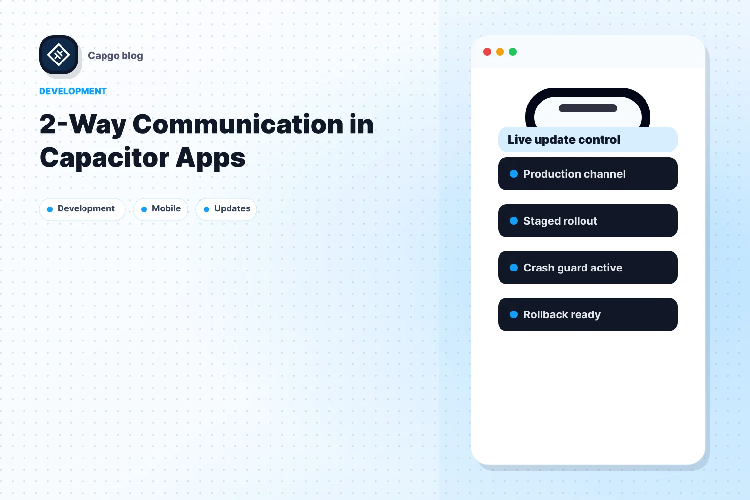
发布操作的实际现实变得明显。安全区域回归、破坏的padding规则或坏的破坏性按钮颜色通常出现在JavaScript或CSS中。如果该bug在生产环境中运行,等待完整的商店发布可以将小的视觉缺陷转化为用户的几天的挫折。
一个实用的选择是为Capacitor应用程序提供实时更新服务。例如 Capgo 将更新的Web包传递给团队,使他们可以在等待应用商店审查时不必等待,直接修复JavaScript、CSS、复制、配置和资产修复,这对于动作弹出窗口样式或覆盖层bug漏过QA时非常相关。
UI覆盖层正是这种安全网的最佳体现。它们是高度可见的、易于破坏的,并且通常可以通过不重建原生code来修复。
如果您的团队定期发布Ionic或Capacitor应用程序 Capgo 值得评估的就是它作为您的发布流程的一部分。它为您提供了一种推送 web 层修复的方法,用于解决问题,如动作面板布局错误、样式回归和复制错误,而保持对发布渠道和更新行为的控制。
从 Ionic 动作面板:2026 年完整指南继续
如果您正在使用 Ionic 动作面板:2026 年完整指南 来规划迁移和企业运营,连接它与 Capgo 企业 为 Capgo 企业中的产品工作流程 Ionic 企业插件替代品 为 Ionic 企业插件替代品中的产品工作流程 Capgo 替代品 为 Capgo 替代品中的产品工作流程 Capgo 咨询 为Capgo咨询产品工作流程 Capgo高级支持 为Capgo高级支持产品工作流程