Puede enviar una aplicación de múltiples plataformas que pase la revisión de QA, pase la revisión de la tienda y aún así decepcione a los usuarios en los primeros cinco minutos. El inicio de sesión funciona. La navegación funciona técnicamente. El API devuelve datos. Sin embargo, las reseñas dicen que la aplicación se siente lenta, incómoda o insegura.
Es ese vacío donde experiencia del usuario en la aplicación vive.
Capacitor y los equipos de Electron se encuentran con esto todo el tiempo porque la entrega de características es visible dentro del equipo, mientras que la fricción aparece fuera de él. Una ventana de navegador tarda un latido demasiado largo en volverse interactiva. Una ventana de escritorio se restaura en un estado extraño. Un spinner de formulario no explica si el trabajo está en curso o congelado. Una actualización arregla un bug pero deja a la mitad de la base de usuarios en una versión más antigua durante días. Ninguno de esos problemas parece dramático en una demostración de sprint. Juntos, definen si las personas siguen utilizando el producto.
La mala experiencia del usuario ya no es un problema estético. Según Adjust, el 90% de los usuarios dijo que la mala rendimiento fue la razón principal por la que dejaron de usar una aplicación en su guía sobre la experiencia del usuario en aplicaciones móviles. Para los equipos de ingeniería, eso cambia la conversación. La UX no es una capa que se agregue después de que la aplicación funcione. Es el resultado operativo de la rendimiento, la confiabilidad, la claridad y la rapidez con la que los usuarios alcanzan el valor.
Para los equipos de múltiples plataformas, eso crea tanto riesgo como oportunidad. Riesgo, porque un código compartido puede extender la misma fricción a iOS, Android y escritorio. Oportunidad, porque una solución medida puede mejorar el viaje en todas partes si se instrumentan los momentos adecuados y se envían actualizaciones de manera segura.
Índice
- Introducción ¿Por qué una aplicación que funciona no es suficiente?
- Los cuatro pilares de la experiencia del usuario en aplicaciones modernas
- ¿Cómo medir la experiencia del usuario de la aplicación con métricas accionables?
- Estrategias prácticas para mejorar la UX de aplicaciones transversales
- El papel de las actualizaciones confiables en la mejora continua de la UX
- Poniendo Todo en Acción Tu Primer Ciclo de Mejora de UX
Introducción ¿Por qué una aplicación ‘funcionante’ no es suficiente
Una aplicación que funciona completa tareas. Una buena aplicación ayuda a las personas a completar tareas sin vacilación, confusión o suposiciones. Eso no son lo mismo.
Muchos equipos descubren esto después del lanzamiento. Los probadores internos conocen bien el producto, por lo que avanzan con paciencia y contexto. Los usuarios reales no. Llegan fríos, en una pantalla pequeña, entre reuniones, con una conectividad débil o con una batería de laptop casi muerta. No importa que la arquitectura sea elegante si la primera acción útil tarda demasiado o si la interfaz de usuario se congela brevemente cuando tocan.
El costo oculto de un UX técnicamente aceptable
Las pilas de aplicaciones cruz-plateformas amplifican este problema de maneras específicas. Capacitor las aplicaciones a menudo heredan suposiciones web que no se sostienen en condiciones móviles nativas. Las aplicaciones de Electron pueden volverse pesadas, especialmente cuando los equipos tratan el escritorio como un entorno ilimitado y agregan trabajo de arranque, sincronización de fondo y paquetes front-end grandes.
El resultado no siempre es un crash. A menudo es algo más tranquilo:
- Vacilación: Los usuarios se detienen porque el siguiente paso no es obvio.
- Retraso: Un botón responde con lentitud suficiente para que la gente toque de nuevo.
- Desconfianza: Los datos parecen estar desactualizados, por lo que los usuarios se preguntan si sincronizó correctamente.
- Abandono: La onboarding se completa técnicamente, pero la gente nunca llega al valor central del producto.
Regla práctica: Si los usuarios describen la aplicación como “incómoda”, suelen estar reportando una cadena de pequeñas decisiones de ingeniería y productos, no un problema de diseño visual único.
Por qué esto se siente con la ingeniería, no solo con el diseño
En productos de múltiples plataformas, muchos de los problemas UX de mayor impacto provienen de detalles de implementación. La invalidación de caché afecta si el contenido se siente confiable. El tamaño del paquete afecta el tiempo de interacción. La persistencia del estado afecta si los usuarios se sienten orientados cuando vuelven a abrir la aplicación. La entrega de actualizaciones afecta cuánto tiempo desaparece la fricción en el campo.
Por eso, los equipos maduros tratan la experiencia del usuario de la aplicación como trabajo compartido entre producto, diseño, QA e ingeniería. Los diseñadores moldean las flujos. El producto prioriza los resultados. Los ingenieros deciden si la experiencia se mantiene rápida, estable y recuperable en condiciones reales.
Latencia: __CAPGO_KEEP_0__
Si la aplicación funciona solo cuando todo sale bien, los usuarios la seguirán llamando rota.
Los Cuatro Pilares de la Experiencia de Usuario Moderna de Aplicaciones
La forma más sencilla de evitar que la UX se vuelva vaga es dividirla en cuatro pilares: usabilidad, rendimiento, confiabilidad y valor. Si uno es débil, los usuarios lo sienten incluso cuando los otros son fuertes.

La usabilidad significa que el camino es obvio
La usabilidad se refiere a si los usuarios pueden saber qué hacer a continuación y recuperarse cuando cometen un error. Esto incluye etiquetas de navegación, colocación de controles, comportamiento de formularios, estados vacíos y si la aplicación respeta las expectativas de la plataforma.
En una aplicación Capacitor, la usabilidad deficiente a menudo se manifiesta cuando los equipos copian una interacción web en móvil sin adaptarla. Las suposiciones de ratón no existen. Las páginas de ajustes densas se vuelven exhaustivas. Los blancos de toque se sienten apretados. Una pila de modales que parece bien en escritorio se vuelve desorientadora en un teléfono.
Una buena usabilidad no es llamativa. Es la ausencia de fricción.
El rendimiento y la confiabilidad forman confianza
El rendimiento responde a si la aplicación se siente responde. La confiabilidad responde a si se comporta de manera predecible. Los usuarios rara vez separan esos conceptos limpiamente. Solo saben si confían en la aplicación.
A una pantalla que aparece instantáneamente pero falla durante la sincronización, todavía es una mala experiencia. Una aplicación estable que tarda demasiado en volverse interactiva también pierde a la gente. Esto es por qué el análisis a nivel de sesión importa. En su artículo sobre puntuación de UX, Dynatrace describe un modelo que clasifica cada sesión como Satisfactorio, Frustrante, o Tolerable combinando el análisis de rendimiento y la detección de errores en un solo métrica. Eso es un enfoque útil para los desarrolladores porque la velocidad promedio de página no les dirá qué viajes se sintieron rotos.
Para los equipos de Electron, esto a menudo significa observar el comportamiento de arranque, la presión de memoria y la respuesta de la renderización. Para los equipos de Capacitor , significa prestar atención a la secuencia de arranque, las llamadas de puente y si las pantallas dependientes de la red se degradan suavemente.
Un usuario no experimenta su diagrama de arquitectura. Experimenta una sesión a la vez.
El valor es la razón por la que la gente regresa
Una aplicación puede ser usable, rápida y estable pero todavía subdesempeñarse si retrasa el momento en que los usuarios obtienen lo que vinieron a buscar. El valor es el nivel de resultados. ¿El usuario completó la tarea, resolvió el problema o alcanzó el beneficio que justificó abrir la aplicación?
Muchos productos pesados en características a menudo tropiezan: los equipos agregan superficies, ajustes y personalización antes de estrechar el viaje central. La aplicación se vuelve más ancha sin mejorar.
Una forma útil de evaluar los cuatro pilares es hacerse estas preguntas:
| Pilar | Pregunta fundamental | Modo de falla cruzada típico entre plataformas |
|---|---|---|
| Usabilidad | ¿Pueden los usuarios saber qué hacer a continuación? | Flujos estilo web copiados a móvil o escritorio sin cambios |
| Rendimiento | ¿Reacciona la aplicación lo suficientemente rápido para sentirse viva? | Paquetes pesados, trabajo de inicio bloqueante, transiciones lentas |
| Fiabilidad | ¿Pueden los usuarios confiar en la aplicación para que siga funcionando? | Concursos, sincronización bloqueada, interfaz congelada, estado local inconsistente |
| Valor | Do los usuarios llegan al motivo por el que lo instalaron? | Una onboarding larga, la activación retardada, los caminos de características ruidosos |
Los cuatro pilares mantienen también las conversaciones de equipo en el suelo. En lugar de decir “la UX necesita trabajo”, puedes decir que el camino de onboarding es comprensible pero demasiado lento, o que la característica es valiosa pero insegura en conectividad débil. Ese es el nivel en el que los equipos pueden mejorar la experiencia del usuario de la aplicación.
Cómo medir la experiencia del usuario de la aplicación con métricas acciones
La forma más rápida de perder problemas de UX es mirar los conteos de instalaciones y totales de compromiso amplio sin medir la fricción. Los descargas no te dicen si las personas se quedaron atascadas, se volvieron impacientes o abandonaron antes de llegar al valor.
Para aplicaciones de múltiples plataformas, las métricas más útiles conectan el comportamiento técnico a los resultados del usuario. Quieres saber si una mala experiencia proviene de bloqueos, interfaces congeladas, onboarding confuso o un retraso de actualización que deja a los usuarios en una versión más antigua.
Medir fricción antes de medir escala
Comienza con los señales que exponen el dolor durante el uso real. En su guía a los métricas móviles de análisis importantes, UXCam recomienda rastrear tasa de usuarios sin bloqueos con un objetivo de más del 99% diario, congelamiento de interfaz se define como no respondiente para 2+ segundos, y golpes de rabia se define como 4+ golpes en un segundo en el mismo elemento. La misma guía dice que los usuarios que alcanzan su evento de activación en menos de 60 segundos de la primera sesión retienen con mucho más altas tasas.
Esa métrica es inusualmente útil porque se conecta directamente a lo que los usuarios sienten:
- Tasa de usuarios sin errores Te dice si la inestabilidad es generalizada o aislada.
- Congelamientos de interfaz de usuario Revela momentos en los que los usuarios creen que la aplicación dejó de escuchar.
- Golpes de ira Exponen controles que parecen disponibles pero no responden con claridad.
- Tiempo hasta la primera acción significativa Te dice cuán rápido los usuarios alcanzan el primer beneficio real.
Para equipos que implementan instrumentación, un punto de partida práctico es configurar la monitorización de rendimiento en aplicaciones Capacitor y hacer visibles a los equipos de producto y ingeniería los eventos de la primera sesión.
Un conjunto de métricas prácticas para productores y ingenieros
No todos los equipos necesitan una gran taxonomía de análisis. La mayoría necesita un pequeño conjunto que confíen y revisen cada lanzamiento.
| Categoría de métrica | Métrica clave | ¿Qué mide? | ¿Por qué importa para UX? |
|---|---|---|---|
| Salud técnica | Tasa de usuarios sin errores | ¿Cuántos usuarios completan sesiones sin errores? | La estabilidad es una expectativa básica |
| Salud técnica | Sesiones sin errores | ¿Cuántas sesiones terminan sin un error? | Muestra si las fallas están concentradas o están extendidas |
| Salud técnica | Congelamientos de interfaz | Moments en los que la interfaz no es reactiva | Captura de lentitud percibida, no solo el tiempo de backend |
| Salud técnica | Rage taps | Taps repetidos en el mismo elemento en un breve intervalo | Indica confusión o falta de retroalimentación |
| Activación | Tiempo hasta la primera acción significativa | Cómo rápidamente los usuarios llegan a la primera acción valiosa | Muestra si los retrasos en la onboarding tienen valor |
| Participación | Longitud de sesión | ¿Cuánto tiempo permanecen activos los usuarios? | Útil cuando se combina con el contexto de tarea |
| Participación | Usuarios activos y comportamiento de retorno | ¿Vuelven las personas repetidamente? | Indica hábito, utilidad o ambos |
| Funel | Conversión de paso | Cumplimiento en cada etapa de flujo clave | Ubica puntos de entrega exactos |
| Análisis de viajes | Flujos de pantalla y rutas | Las rutas que toman los usuarios | Exposición de bucles, finales muertos y desvíos |
Algunas precauciones importan aquí.
Primero, no trates las sesiones más largas como automáticamente buenas. En una aplicación de soporte, una sesión larga puede significar confusión. En una aplicación de contenido, puede significar satisfacción. El contexto importa.
Segundo, no dejes que un promedio único oculte el dolor de los usuarios. Un tiempo de carga mediano puede parecer aceptable mientras que una pantalla de inicio específica se congela en dispositivos Android más antiguos o una pantalla de sincronización de escritorio se queda colgada después de despertar desde el sueño.
Registra los momentos en que los usuarios pierden confianza, no solo los momentos en que tu tablero de control parece saludable.
El objetivo no es recopilar todo. Es construir una capa de medición que te ayude a decidir qué arreglar a continuación.
Estrategias prácticas para mejorar la experiencia de usuario en aplicaciones de múltiples plataformas
Los equipos a menudo intentan mejorar la UX agregando brillo primero. Nuevas animaciones, más ilustraciones de estado vacío, ajustes de configuración más ricos, personalización adicional. Esa mejora puede ayudar, pero rara vez rescatan una experiencia débil.
Para productos transversales, los fundamentos ganan más a menudo. La velocidad que los usuarios pueden sentir. La retroalimentación que explica qué está sucediendo. Flujos que sobreviven a malas redes. Interfaces que respetan las convenciones del dispositivo en el que se ejecutan.

Arregle la velocidad percibida primero
La velocidad percibida es donde la ingeniería puede crear ganancias UX sin redactar la aplicación completa. Los usuarios no necesitan cada byte cargado instantáneamente. Necesitan evidencia rápida de que la aplicación está lista, responde y se dirige hacia su objetivo.
Eso suele significar:
- Muestre retroalimentación inmediata: Los botones deben cambiar de estado tan pronto como se presionen. Si el trabajo comienza, dígaselo.
- Utilice esqueletos con cuidado: Funcionan cuando el diseño final es predecible. No ayudan cuando ocultan retrasos de backend evitables.
- Deje de lado el trabajo no crítico: La inicialización de análisis, las solicitudes secundarias y los activos de baja prioridad no deben bloquear la primera pantalla útil.
- Reduzca el peso de los activos: Equipos de plataforma cruzada a menudo llevan imágenes, fuentes y dependencias de front-end sobredimensionadas más tiempo del que se dan cuenta.
Más tarde, cuando necesite explicar un cambio a los partes interesadas o revisores de tiendas de aplicaciones, la creación de demos de productos de alta calidad ayuda a hacer visibles los mejoras de UX de una manera en la que las capturas de pantalla a menudo no pueden.
Un recorrido visual más profundo puede ayudar a los equipos a alinearse en lo que “rápido” debería ser en la práctica:
Diseñe para redes débiles y dispositivos desiguales
Muchos consejos de UX asumen conectividad estable y hardware actual. Los usuarios reales no viven en ese mundo. El artículo de Prototypr sobre problemas de usabilidad móvil desatendidos destaca una pregunta olvidada: ¿cómo se comporta la aplicación sin red, con una red pobre o con datos costosos? Eso es especialmente importante para los equipos de Capacitor que envían a audiencias móviles amplias.
Patrones prácticos de resistencia incluyen:
- Cache el último estado útil: Si no está disponible datos frescos, muestre el último conocido buen estado con un estado claro.
- Intención de usuario en cola: Si alguien elabora, envía o cambia una preferencia offline, preserva la acción y sincroniza más tarde donde corresponda.
- Explicar estados de sincronización de manera clara: ‘Guardado localmente’ y ‘esperando sincronizar’ reducen la ansiedad del usuario más que un indicador de carga sin texto.
- Reducir el bullicio de red: Envía solicitudes en lote donde sea posible y evita patrones de recarga de pantalla completa después de acciones pequeñas.
Para detalles de interfaz que se traducen mejor a través de iOS, Android y capas web compartidas, vale la pena revisar prácticas de interfaz de usuario y experiencia de usuario cruz-plataforma para aplicaciones Capacitor.
La confiabilidad en condiciones malas a menudo importa más que agregar otra pestaña de características.
Mantener patrones de interacción aburridos en los lugares adecuados
Este es el lado contrario. La experiencia de usuario de aplicaciones excelentes no siempre proviene de la novedad. A menudo proviene de la restricción.
La navegación debe coincidir con la plataforma a menos que tenga una razón fuerte para no hacerlo. El comportamiento de retroceso debe ser predecible. Las ventanas de escritorio deben restaurarse limpiamente. Los patrones de confirmación deben reservar fricción para acciones riesgosas, no para las cotidianas.
Capacitor y Electron facilitan compartir code. No eliminan la necesidad de respetar el contexto. Los usuarios aún esperan que los móviles y los escritorios se comporten como ellos mismos, no como una plataforma mediana comprometida.
El papel de las actualizaciones confiables en la mejora continua de la experiencia del usuario
Mejorar la experiencia del usuario no es un proyecto de diseño con una meta. Es una disciplina de lanzamiento. Se mide la fricción, se envía una corrección, se observa qué cambió y se repite.
En el trabajo cruzado, ese bucle es aún más importante porque muchos problemas de UX son pequeños pero urgentes. Un estado de carga roto, un retraso en la retroalimentación de botones, copias obsoletas, estados vacíos pobres o pasos de onboarding incómodos pueden no justificar un ciclo de envío completo en la tienda si la corrección vive en JavaScript, CSS, configuración o activos. Pero dejarlo en el campo todavía lastima a los usuarios.

Una corrección de UX solo importa cuando los usuarios reciben realmente la corrección
Muchos equipos hablan sobre la velocidad de iteración como una métrica interna. Los usuarios la experimentan de manera diferente. Para ellos, la pregunta es simple: ¿la aplicación se mejoró rápidamente o el mismo problema molesto siguió durante semanas?
Glassbox en su visión general de métricas de aplicaciones móviles destaca que la experiencia del usuario de las aplicaciones modernas se juzga por el uso recurrente, la finalización de la canalización y la confiabilidad, junto con los índices de retención de día 1, día 7 y día 30, y las tasas de sesión sin errores superiores al 99,5% __CAPGO_KEEP_0__ y Electron facilitan compartir __CAPGO_KEEP_1__. No eliminan la necesidad de respetar el contexto. Los usuarios aún esperan que los móviles y los escritorios se comporten como ellos mismos, no como una plataforma mediana comprometida. As los indicadores principales de éxito. Esa forma de enfocar desvía la atención de la cantidad de envíos y hacia si las mejoras llegan al recorrido del usuario a tiempo para importar.
Las actualizaciones confiables forman parte de eso. Si la mitad de tu audiencia sigue utilizando una versión web más antigua, tus métricas se desvanecen. El producto muestra comportamientos mixtos. El soporte no puede explicar por qué algunos usuarios siguen encontrando un problema resuelto. El desarrollo pierde confianza en el impacto de la liberación.
Utilice el control de lanzamiento como parte del flujo de trabajo de UX
Un patrón mejor es tratar a los mecanismos de entrega como parte de la experiencia del usuario del aplicación en sí misma.
Es decir, hacer cosas como:
- Desarrolle una entrega estrecha primero: Envíe un cambio de UX a usuarios internos, grupos de beta o a un segmento definido antes de la liberación amplia.
- Observar la adopción y los errores: Necesita visibilidad sobre qué dispositivos se actualizaron, cuáles fallaron y cuáles se deshicieron.
- Vincule a los grupos de liberación a comportamientos: Compare la activación de la primera sesión, la finalización del canal o las señales de frustración antes y después del cambio.
- Preservar un camino de devolución rápida: Las pruebas de UX siguen siendo cambios de producción. Si un nuevo flujo confunde a las personas, réselo rápidamente.
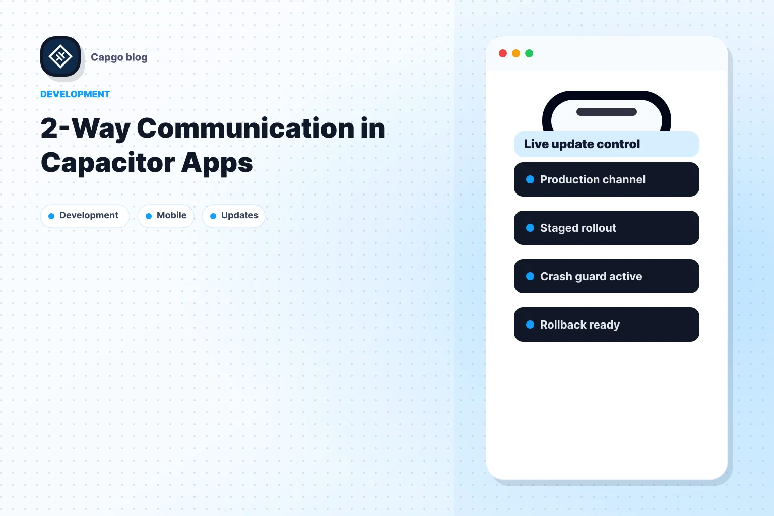
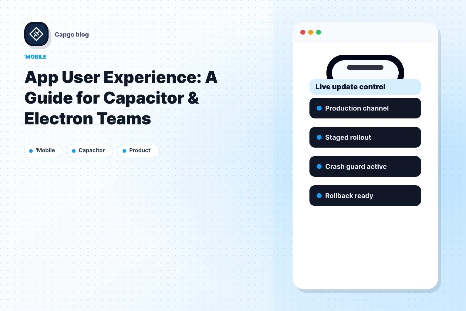
Para equipos que trabajan en el ecosistema Capacitor, los servicios que explican cómo funcionan las actualizaciones en vivo para Capacitor hacen que este ciclo de lanzamiento sea más fácil de operarizar. Una opción es Capgo, que entrega paquetes web firmados a los canales objetivo para Capacitor y aplicaciones Electron, aplica actualizaciones en la próxima lanzamiento y proporciona características de rollback y observabilidad. Eso es útil cuando el cambio de UX vive en la capa web y necesitas una iteración controlada sin tener que esperar a un ciclo de tienda completo.
La iteración rápida solo ayuda cuando la seguridad de lanzamiento es lo suficientemente buena para que el equipo realmente envíe la corrección.
La observabilidad fuerte y la confiabilidad de la actualización se encuentran. Los mejores equipos de UX no solo identifican la fricción. Ellos la eliminan mientras aún pueden medir la diferencia de manera clara.
Poniendo Todo Juntos Tu Primer Ciclo de Mejora de UX
Muchos equipos no necesitan una revisión de UX completa. Necesitan un ciclo estrecho que demuestre que el proceso funciona.
Comienza con un viaje que los usuarios tocan temprano y a menudo. La primera lanzamiento, el inicio de sesión, el inicio de sesión, la búsqueda, el pago, la finalización de la forma o el regreso a una tarea en curso son todos buenos candidatos. Elige el que más directamente afecte si los usuarios alcanzan el valor.
Comienza con un viaje, no con toda la aplicación
Una primera aproximación práctica se ve así:
- Elige una métrica de resultado: El tiempo para la primera acción significativa es un candidato fuerte para muchas aplicaciones.
- Revisa señales de fricción alrededor de ese flujo: Busca congelamientos, congelamientos, repetidos, loops confusos y puntos de abandono.
- Define una solución estrecha: Reduce el trabajo de arranque, aclara una pantalla, elimina un paso bloqueante o mejora el manejo en línea para una acción.
- Envía a un público limitado: Mantén el radio de explosión lo suficientemente pequeño para aprender de manera segura.
- Compara el comportamiento después de la liberación: Busca una ruta de completación más limpia y menos indicadores de frustración.
Esto fuerza la disciplina. Los equipos dejan de debatir UX en el abstracto y comienzan a probar si una implementación específica mejoró un viaje de usuario específico.
Correr un pequeño ciclo y aprender rápido
La clave es hacer que el ciclo sea lo suficientemente aburrido para que lo repitas. No comiences con un gran rediseño. Esos a menudo mezclan demasiadas variables y hacen que sea difícil saber qué ayudó.
En su lugar, mejora un camino a la vez y construye hábitos compartidos alrededor de la evidencia. El producto debe saber qué métrica importa. El ingeniero debe saber qué evento marca el éxito. El soporte debe saber qué cambió y cómo identificar desajustes de actualizaciones. Si estás coordinando la comunicación de lanzamiento alrededor de un nuevo flujo de trabajo o capacidad, un libro de playas de introducción de nuevos productos puede ayudar a los equipos a alinear la mensajería, las expectativas de lanzamiento y la preparación interna.
Un buen experiencia de usuario de la aplicación suele surgir de esta manera. No de un solo rediseño brillante, sino de muchas correcciones meditadas que eliminan la indecisión, restauran la confianza y ayudan a los usuarios a obtener valor más rápido.
If you’re shipping Capacitor or Electron apps and need a safer way to iterate on UX in production, Capgo o aplicaciones de Electron y necesitas una forma más segura de iterar en la UX en producción,
Capacitor
es digno de evaluación. Les permite a los equipos enviar actualizaciones de capas web, cambios de copia, actualizaciones de configuración y activos rápidamente con despliegues dirigidos, protección de rollback y visibilidad de lanzamiento, lo que hace que la mejora continua de la UX sea mucho más fácil de gestionar. Sigue adelante desde la experiencia de usuario de la aplicación: Una guía para equipos de Capacitor & Electron. Si estás utilizando el libro de playas de introducción de nuevos productos de la aplicación de la experiencia de usuario: Una guía para equipos de Capacitor & Electron para planificar el trabajo de plugin nativo, conectarlo con Capgo Directorio de Plugins para el flujo de trabajo del producto en Capgo Directorio de Plugins, Capacitor Plugins por Capgo para el detalle de implementación en Capacitor Plugins por Capgo, Agregar o Actualizar Plugins para el detalle de implementación en Agregar o Actualizar Plugins, Alternativas de Plugins de Ionic Enterprise para el flujo de trabajo del producto en Alternativas de Plugins de Ionic Enterprise, y Capgo Compilaciones Nativas para el flujo de trabajo del producto en Capgo Compilaciones Nativas.