Portrait orientation means the screen is taller than it is wide (height is greater than width). Landscape orientation is the opposite: wider than tall. Typical portrait uses include phone feeds, articles, forms, and chat. Landscape fits video, maps, and dashboards that need horizontal space. Aspect ratio (such as 9:16 portrait or 16:9 landscape) describes the width-to-height relationship; orientation only tells you which side is longer.
Portrait vs landscape example
If you searched for an image of portrait orientation, this side-by-side view is the idea: one tall frame and one wide frame on the same device class.
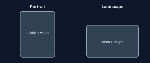
Portrait narrows attention into a vertical scroll. Landscape exposes more columns and side-by-side UI. They are layout contexts, not just rotation labels.
| Orientation | Shape | Common uses |
|---|---|---|
| Portrait | Taller than wide | Feeds, reading, forms, chat |
| Landscape | Wider than tall | Video, maps, charts, games |
Orientation is not the same as resolution or aspect ratio. Two devices can both be portrait while using different pixel sizes and ratios. Responsive layouts should key off viewport shape, not a single phone model.
Portrait orientation in CSS
Use CSS when rotation should change spacing or structure. The @media (orientation: portrait) query matches viewports where height is greater than width. MDN documents this under orientation media features.
/* Default: portrait-first single column */
.page {
  display: grid;
  grid-template-columns: 1fr;
  gap: 16px;
}

.sidebar {
  display: none;
}

@media (orientation: landscape) {
  .page {
    grid-template-columns: 280px 1fr;
  }

  .sidebar {
    display: block;
  }
}

@media (orientation: portrait) {
  .hero {
    padding-block: 24px;
  }
}
Start from the orientation most users see first, then add landscape rules. Avoid fixed viewport heights that break when the keyboard or browser chrome appears. Test forms and sticky headers in both orientations on real hardware.
For JavaScript that must react to rotation (charts, maps, custom shells), listen to screen.orientation change events or compare window.innerHeight to window.innerWidth. Keep layout in CSS when possible.
Locking orientation in mobile and Capacitor apps
Browsers treat orientation lock as a preference. Native apps and Capacitor projects can enforce screen direction per screen when rotation would hurt the task (sign-in, payment, kiosk flows).
The @capgo/capacitor-screen-orientation plugin reads the current mode, locks portrait for a route, and unlocks when the user leaves that screen. See the Screen Orientation plugin docs for API details.
import { ScreenOrientation } from '@capgo/capacitor-screen-orientation';

await ScreenOrientation.lock({ orientation: 'portrait' });

const { type } = await ScreenOrientation.orientation();
console.log(type);

await ScreenOrientation.unlock();
Lock sparingly. If rotation only changes spacing, adapt the layout instead. When you do lock, tie lock and unlock to page lifecycle so media and settings screens can still use landscape. For broader layout patterns across iOS and Android, see cross-platform UI and UX best practices for Capacitor apps.
FAQ
What is portrait orientation?
Portrait orientation means the display is taller than it is wide. Height is greater than width, so the long edges run vertically. Phones held upright for reading, chat, or scrolling are usually in portrait.
What is the difference between portrait and landscape orientation?
Portrait is taller than wide. Landscape is wider than tall. The same device switches between them when you rotate it, but the aspect ratio and layout space change, so UI should adapt rather than only stretch.
How do I use @media (orientation: portrait) in CSS?
Add a media query with @media (orientation: portrait) { ... } to apply styles when the viewport height exceeds its width. Pair it with layout rules for landscape using @media (orientation: landscape) when you need both shapes.
What does change orientation mean on a phone or app?
Changing orientation means rotating the device or allowing the app to rotate so the screen moves between portrait and landscape. On the web, the viewport dimensions swap. In native and Capacitor apps, the OS may also animate the transition and update safe areas.
What is content orientation?
Content orientation is how content is laid out relative to the frame, not only which way the device is held. A portrait screen might still show a wide chart or video letterboxed inside it. Match layout and media to the task, not only the default device angle.
Can you show an example of portrait vs landscape?
Yes. Portrait looks like a tall phone frame where height is greater than width. Landscape looks like a wide frame where width is greater than height. Scroll to the diagram under Portrait vs landscape example for a labeled picture.
If you’re shipping Capacitor apps and need controlled orientation behavior alongside fast post-release fixes, Capgo is worth a look. It provides live updates for CapacitorJS and Electron apps, and it also maintains plugins for app capabilities such as screen orientation, which can help when you need to lock or enable specific views without rebuilding your whole release process.