Independiente de marco
Utilice elementos personalizados basados en estándares directamente o utilice ayudantes de configuración para React, Vue, Angular, Svelte y Solid.
Independiente de marco
Utilice elementos personalizados basados en estándares directamente o utilice ayudantes de configuración para React, Vue, Angular, Svelte y Solid.
Capacitor listo
Respetar áreas de seguridad, movimiento de teclado, gestos de borde nativos y atenuación de tema de WebView desde la capa web.
Cada forma de hoja
Componer hojas de abajo, cajones laterales, hojas de arriba, diálogos centrados, tostadas, hojas desprendidas, tarjetas, páginas y luces de escena.
CSS moderno
Autor detiene con em, rem, unidades de vista, calc(), y variables CSS mientras el tamaño por defecto permanece em basado.
@capgo/capacitor-sheets es para aplicaciones Capacitor que necesitan sobreposiciones móviles de alta calidad sin adoptar un marco de trabajo de interfaz de usuario específico. Se envía como elementos personalizados, por lo que el paquete principal no tiene dependencia de tiempo de ejecución de React, Vue, Angular, Svelte o Solid.
Usa cuando necesites:
| Caso de uso | Capgo Patrón de hojas |
|---|---|
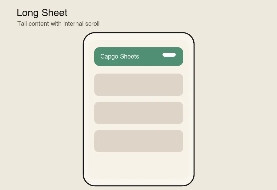
| Hoja larga | cap-sheet con contenido natural desplazarse o cap-scroll |
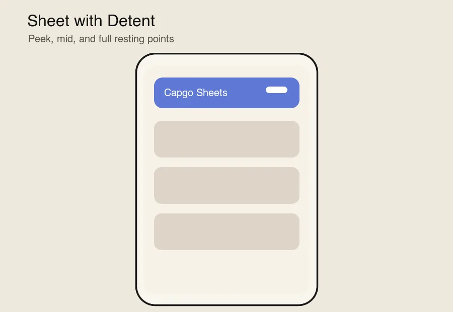
| Hoja con Detente | detents="18em 32em" más stepTo() o un disparador de paso |
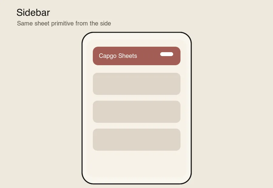
| Sidebar | content-placement="left" o content-placement="right" |
| Bottom Sheet | por defecto content-placement="bottom" |
| Hoja con teclado | native-focus-scroll-prevention y manejo de desplazamiento de vista visual |
| Toast | inert-outside="false", focus-trap="false", y no se puede cerrar con un clic fuera |
| Hoja Desconectada | cap-sheet-special-wrapper __CAPGO_KEEP_0__ |
| Hoja desde la parte inferior | __CAPGO_KEEP_0__ |
| Hoja Superior | content-placement="top" |
| Hoja con Pila | cap-sheet-stack __CAPGO_KEEP_0__ |
| Hoja con Profundidad | cap-sheet-outlet __CAPGO_KEEP_0__ |
| Página de Paralaje | cap-sheet-outlet __CAPGO_KEEP_0__ cap-scroll __CAPGO_KEEP_0__ |
| Página | contenido de pantalla completa que entra desde un borde |
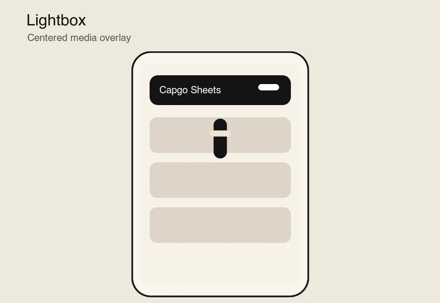
| Lightbox | content-placement="center" con fondo y contenido de medios |
| Hoja persistente con detente | default-presented, swipe-dismissal="false", y inert-outside="false" |
| Tarjeta | contenido de hoja compacta centrado |
<cap-sheet> administra el estado de presentación, detentes, colocación, gestos, accesibilidad y eventos.<cap-sheet-trigger> declara acciones de presentar, deshacer, alternar y paso de detente.<cap-sheet-view> posiciona la capa de sobreposición y aplica desplazamientos de área segura y teclado.<cap-sheet-backdrop> dibuja un fondo de respaldo sincronizado con el progreso.<cap-sheet-content> dibuja la superficie de la hoja.<cap-sheet-handle> proporciona controles de arrastre y desplazamiento de teclado.<cap-sheet-stack> coordina hojas apiladas.<cap-sheet-outlet> exposa el progreso de la hoja a efectos de página, profundidad y paralaje.<cap-scroll> y <cap-scroll-content> exponga progreso de desplazamiento y distancia de desplazamiento.setupSheet(element, options?) configura una hoja desde efectos de marco o hooks de ciclo de vida.La hoja de vista predeterminada lee env(safe-area-inset-*) y Capacitor-estilo --safe-area-inset-* variables de respaldo, luego aplica las aristas seleccionadas como relleno alrededor de la superposición. safe-area="auto" protege todas las aristas; use safe-area="bottom left right" o safe-area="none" cuando un caso de uso necesita un comportamiento diferente.
El manejo del teclado está habilitado por defecto. La hoja escucha eventos de redimensionamiento y desplazamiento, agrega un desplazamiento del teclado a la vista previa y enfoca controles con visualViewport para que los inputs permanezcan visibles por encima del teclado de software. preventScroll El paquete se ejecuta en la capa web. No renderiza hojas de fondo nativas de UIKit o Android, por lo que su aplicación conserva el control de estilo completo mientras respeta las restricciones de WebView que importan en __CAPGO_KEEP_0__.
The package runs in the web layer. It does not render native UIKit or Android bottom sheets, so your app keeps full styling control while still respecting the WebView constraints that matter in Capacitor.
Demos y Entornos de Pruebas
| Hoja larga | Detentes |
|---|---|
 |  |
| Barra lateral | Ventana emergente |
|---|---|
 |  |
Si estás utilizando @capgo/capacitor-sheets para planificar el trabajo de plugin nativo, conecta con Capgo Directorio de Plugins para el flujo de trabajo del producto en Capgo Directorio de Plugins, Capacitor Plugins por Capgo para los detalles de implementación en Capacitor Plugins por Capgo, Agregar o Actualizar Plugins para los detalles de implementación en la sección de Agregar o Actualizar Plugins Alternativas de Plugins de Ionic Enterprise para el flujo de trabajo del producto en Alternativas de Plugins de Ionic Enterprise, y Capgo Compilaciones Nativas para el flujo de trabajo del producto en Capgo Compilaciones Nativas.