Agnostique par rapport au framework
Utilisez des éléments personnalisés basés sur des normes directement ou utilisez des aides de configuration pour React, Vue, Angular, Svelte et Solid.
Agnostique par rapport au framework
Utilisez des éléments personnalisés basés sur des normes directement ou utilisez des aides de configuration pour React, Vue, Angular, Svelte et Solid.
Capacitor prêt
Respectez les zones de sécurité, les mouvements de clavier, les gestes de bord natifs et l'ombrage de la couleur de la fenêtre WebView depuis la couche web.
Chaque forme de feuille
Composez des feuilles inférieures, des tiroirs latéraux, des feuilles supérieures, des dialogues centrés, des toasts, des feuilles détachées, des cartes, des pages et des lightboxes.
CSS moderne
L'auteur maintient des détails avec em, rem, unités de vue, calc(), et variables CSS tout en gardant la taille par défaut basée sur. em Lorsque l'utiliser
@capgo/capacitor-sheets is for Capacitor apps that need high-quality mobile overlays without adopting a specific UI framework. It ships as custom elements, so the core package has no React, Vue, Angular, Svelte, or Solid runtime dependency.
feuilles inférieures avec un ou plusieurs détails
| Cas d'utilisation | Capgo Modèle de feuilles |
|---|---|
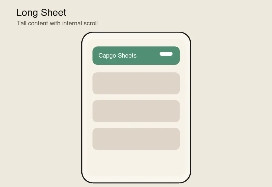
| Feuille longue | cap-sheet avec contenu naturel défilement ou cap-scroll |
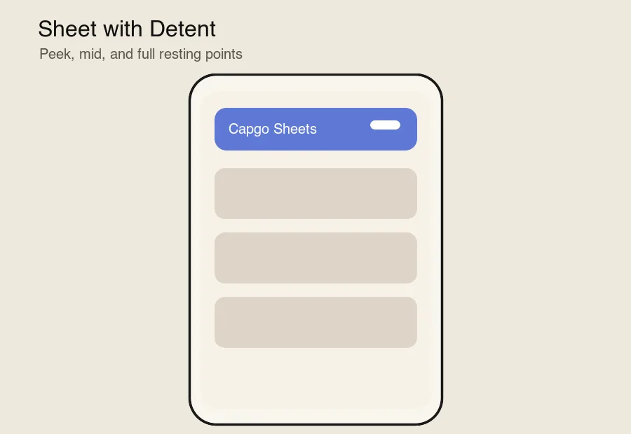
| Feuille de calcul avec Detent | detents="18em 32em" plus stepTo() ou un déclencheur d'étape |
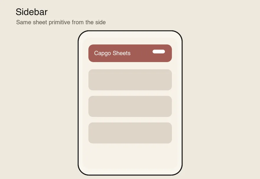
| Barre latérale | content-placement="left" ou content-placement="right" |
| Feuille de calcul inférieure | par défaut content-placement="bottom" |
| Feuille de calcul avec clavier | native-focus-scroll-prevention et prise en charge de décalage de vue de visualisation |
| Toast | inert-outside="false", focus-trap="false", et aucune suppression de clic extérieur |
| Feuille détachée | cap-sheet-special-wrapper plus de marges et de rayon personnalisés |
| Page depuis le bas | contenu de feuille inférieure haute en hauteur |
| Feuille supérieure | content-placement="top" |
| Feuille avec empilement | cap-sheet-stack avec variables de profondeur |
| Feuille avec profondeur | cap-sheet-outlet et des transformations guidées par la progression |
| Page parallaxe | cap-sheet-outlet avec cap-scroll progression |
| Page | contenu plein écran entrant par un bord |
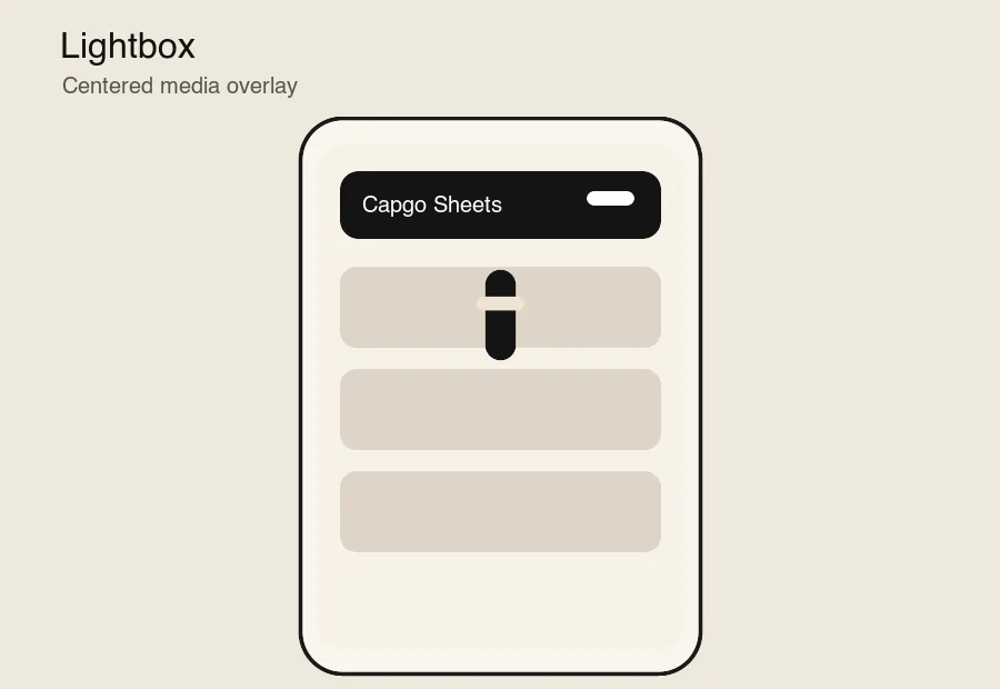
| Lightbox | content-placement="center" avec un fond d'arrière-plan et un contenu multimédia |
| Fenêtre persistante avec détent | default-presented, swipe-dismissal="false"et inert-outside="false" |
| Carte | contenu compact centré de la feuille |
<cap-sheet> gère l'état de présentation, les détent, la disposition, les gestes, l'accessibilité et les événements.<cap-sheet-trigger> déclare les actions de présent, de fermeture, de basculement et de détent-étape.<cap-sheet-view> positionne l'overlay et applique les décalages de zone de sécurité et de clavier.<cap-sheet-backdrop> affiche un fond d'arrière-plan synchronisé sur la progression.<cap-sheet-content> affiche la surface de la feuille.<cap-sheet-handle> fournit des contrôles de déplacement et de détent de clavier.<cap-sheet-stack> coordonne les feuilles empilées.<cap-sheet-outlet> expose la progression de la feuille aux effets de page, de profondeur et de parallaxe.<cap-scroll> et <cap-scroll-content> expose les aides de progression de roulage et de distance.setupSheet(element, options?) configure une feuille à partir d'effets de framework ou de hooks de cycle de vie.La vue par défaut de la feuille de lecture lit env(safe-area-inset-*) et Capacitor-style --safe-area-inset-* les variables de remplacement par défaut, puis applique les arêtes sélectionnées comme bordure autour de l'overlay. safe-area="auto" protège toutes les arêtes ; utilisez safe-area="bottom left right" ou safe-area="none" lorsqu'une utilisation nécessite un comportement différent.
La gestion du clavier est activée par défaut. La feuille écoute les événements de redimensionnement et de défilement, ajoute un décalage de clavier à la vueport et met en surbrillance les contrôles avec visualViewport afin que les entrées restent visibles au-dessus du clavier logiciel. preventScroll Le package fonctionne dans la couche web. Il ne rend pas les feuilles de bas de page natives UIKit ou Android, donc votre application conserve le contrôle de style complet tout en respectant les contraintes de la vue web qui comptent dans __CAPGO_KEEP_0__.
The package runs in the web layer. It does not render native UIKit or Android bottom sheets, so your app keeps full styling control while still respecting the WebView constraints that matter in Capacitor.
fallback variables, then applies the selected edges as padding around the overlay.
| Feuille longue | Détentes |
|---|---|
 |  |
| Barre latérale | Lightbox |
|---|---|
 |  |
Si vous utilisez @capgo/capacitor-feuilles pour planifier le travail de plugin natif, connectez-le avec Répertoire de plugin Capgo pour le flux de travail du produit dans le Répertoire de plugin Capgo Plugins Capacitor par Capgo pour les détails d'implémentation dans les Plugins Capacitor par Capgo, Ajouter ou Mettre à jour des Plugins pour les détails d'implémentation dans l'ajout ou la mise à jour de plugins Alternatives de plugins d'entreprise Ionic pour le flux de travail du produit dans Alternatives de plugins d'entreprise Ionic, et Capgo Rendus natifs pour le flux de travail du produit dans Capgo Rendus natifs.